Jump to content

Photo

Thoughts on the new Qantas rebrand?


  • Please log in to reply
10 replies to this topic

#1
jmfsam

jmfsam

    to be or not to be

  • Member
  • 321 posts

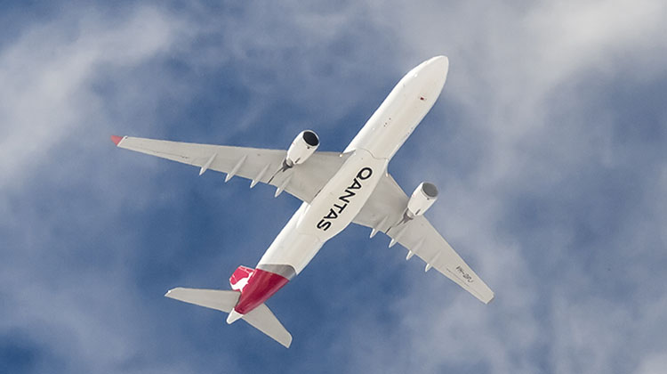
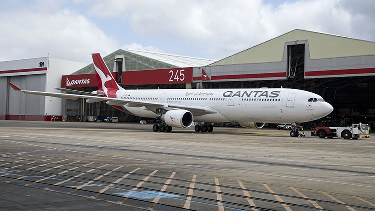
Personally I like it, although not an Australian myself I've flown with the airline multiple times trans-Tasman. Their new economy design feels more like their partner American Airlines with the seat design, it's very swanky and looks amazing, hate to say it but outdoing Air New Zealand :P The old logo felt more 1990s, this one is like a new refresh of the Qantas brand, and not to mention the gorgeous new flagship 787 :wub:


Your thoughts?


CvuzZ2kVUAAfThp.jpg


vZe8iFx.png

1kZZDPA.png


#2
JP.

JP.

    The resident Dutch Belgian

  • Member
  • 1,384 posts

User's Awards

3   
:awesome:

DWA_10_years_sig.png

YAjRqwL.png


#3
vsauce

vsauce

    travelling at 35 km/h

  • Member
  • 636 posts

User's Awards

2      

TRASHHHHHHHHHHHHHHHHHHHHHHHHHHHHHHHHH


09f14b347b.jpg


xjF8rVw.png


#4
sam2875

sam2875

    planes, planes, planes, planes

  • Member
  • 1 posts

I like the new seats etc. but still not sure on the new logo/kangaroo. Seems pretty good though!


#5
S K Y

S K Y

    None of anyone's interest

  • Member
  • 865 posts

User's Awards

7    4   

No. They can't change the kangaroo. They can do anything except that.

The kangaroo will return, though, just like JAL's crane.


msg-21998-0-02795400-1542637702.png

msg-21998-0-01263700-1542637720.png


#6
Chubby Bear

Chubby Bear

    AE's Noob

  • Member
  • 1,213 posts

User's Awards

2    5      

everything is splendid except for that kangaroo...

VHQPJ-underbelly-Kurt-Ams.jpg

livery_small2.jpg


South-Africa_240-animated-flag-gifs.gifNew-Zealand_240-animated-flag-gifs.gif


9IYxwsM.png

ND7sS8w.jpg

#AspireMember  #EnvoyMember #Unknown Alien Species #WorldAllianceMember


#7
jmfsam

jmfsam

    to be or not to be

  • Member
  • 321 posts

Looks slightly decapitated with no arm support


vZe8iFx.png

1kZZDPA.png


#8
eastwind

eastwind

    AE Addict

  • Member
  • 858 posts
yucks

#9
AJ787-9

AJ787-9

    Friendly Aviation Capitalist

  • Member
  • 80 posts

User's Awards

   2    5    2   

The shading would've looked better on the current (now previous) Roo (also, where are the arms?). Not really a fan of the font. The Flying Kangaroo logo by the nose is a nice touch.


CVQgY9y.jpg

UJ3urKq.jpg


#10
Viero

Viero

    Data Collector

  • Member
  • 231 posts

User's Awards

2   

Not too bad overall, but I hate that new font.


Looks like one of those painfully generic ~minimalist~ fonts.


Posted Image

Posted Image


#11
Mr. Wonderful

Mr. Wonderful

    Mr. Wonderful

  • Validating
  • 53 posts

The new logo is really bad. They just keep taking more and more off of that poor kangaroo.


0 user(s) are reading this topic

0 members, 0 guests, 0 anonymous users