
 Sign In
 Create Account


- Owner: ThePessimist (View all images and albums)
- Uploaded: May 24 2021 05:51 PM
- Views: 1,283
- Album The Pessimist One Offs

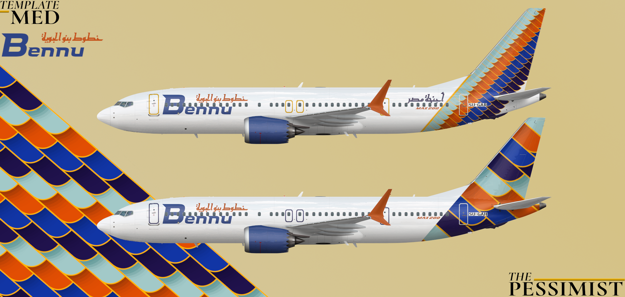
Bennu is Egypt's largest LCC. Founded in the mid 1990s, the airline has seen impressive and consistent growth over its history and this culminated in its fleet renewal program with plans to retire its heavily used T tail MD 80s and 90s in favor of fancy new 737 Maxes configured with an extra exit to allow for a higher density configuration. This coincided with a brand overhaul and the introduction of the new livery. The transition was delayed by the Max engineering issue and later COVID pandemic, but starting in summer 2021, the airline hopes to restart full operations out of its Alexandria hub with 10 of the Max 200s which have been stored at Renton for nearly 3 years.
The above aircraft wears a special "Wings of Egypt" livery which was used to introduce the brand overhaul and is frequently used in press images. The below craft is in the mainline livery with simplified tail design and 35 of the total 40 Max 200s on order will wear this livery.
[Edit: Moved some text about and changed the engine/winglet designs]
[Edit: No more winglet or engine stripes. The colours are less excited and they moved around. The font evokes wings if you squint right.]


I'm trying to like it but I can't for some reason, here are some thoughts..
1. Reg takes a second to find, hard to see over the tail design.
2. Tail looks pretty modern for a LLC (Not a huge issue since other LLCs have adapted some modern tails)
3. Winglets look out of place, doesn't match the design well.
4. The text sandwiches between the L1 door and the cockpit windows would fit better towards the rear between the R2/R3 door
5. The doors would look better painted in the color scheme of the aircraft vrs just a grey/white.
6. The arabic on the back of the 1st design just looks out of place, unsure what is says so I can't give better placement feedback.
7. Engines look a bit bland, find a way to incorporate the design onto them.
There is potential, just a lot of improvements need to be made.
Ok so I'll do this point by point but thanks for the feedback
1) Reg is one a white block now so hopefully it's an easier catch
2) The tail is the whole point, I'm pretty happy with it as is
3 & 7) I moved the winglet design down to the engines where the colors will hopefully match better and then just made the winglets yellow
4) Max 200 text is now below the windows and it's still slightly awkward but it's way better
5) The doors are the same blue as the Bennu text
6) Moved that text, shrunk it a little and changed the color
My Feedback:
1) I think the bottom tail design is LOVELY and should be used for the whole airline.
2) The engine should be either white or one color. The stripes at the bottom date it to the late 90s and early 2000s.
3) The color of the engine and winglet should be one of the more prominent darker colors, like the burnt orange or dark blue to give better color balance.
4) The title placement is a bit questionable, but I don't see any immediate alternatives.
5) The title colors are too saturated and disrupt the color balance.
6) Everywhere I have seen this type in operation it is called the Max-9. I have no clue where Max-200 came from but please check spotting guides and Boeing's website. It would be very amateurish to call it by the wrong type when the template is labeled as the Max-9.
7) Both fonts, English and Arabic don't really flow with the rest of the design, more specifically the tail. If you could find a font with more of a winged tip and took some time shopping for Arabic fonts it would be a lot more cohesive.
8) It would bother me less if you moved the registration above the windows instead of having a cutout in the pattern but that one is your choice exclusively and has no base other than personal preference.
9) Don't forget other small details like the tailskid and invest some more time in the background.
My last bit that fits over all of this is remembering why an element is there. Find a practical reason for each design element and the design will look purposeful and complete.
My Feedback:
1) I think the bottom tail design is LOVELY and should be used for the whole airline.
2) The engine should be either white or one color. The stripes at the bottom date it to the late 90s and early 2000s.
3) The color of the engine and winglet should be one of the more prominent darker colors, like the burnt orange or dark blue to give better color balance.
4) The title placement is a bit questionable, but I don't see any immediate alternatives.
5) The title colors are too saturated and disrupt the color balance.6) Everywhere I have seen this type in operation it is called the Max-9. I have no clue where Max-200 came from but please check spotting guides and Boeing's website. It would be very amateurish to call it by the wrong type when the template is labeled as the Max-9.
7) Both fonts, English and Arabic don't really flow with the rest of the design, more specifically the tail. If you could find a font with more of a winged tip and took some time shopping for Arabic fonts it would be a lot more cohesive.
8) It would bother me less if you moved the registration above the windows instead of having a cutout in the pattern but that one is your choice exclusively and has no base other than personal preference.
9) Don't forget other small details like the tailskid and invest some more time in the background.
My last bit that fits over all of this is remembering why an element is there. Find a practical reason for each design element and the design will look purposeful and complete.
Basically summed up my second round of feedback, but you are completely wrong about the 737-MAX-200. I don't know where you got the 'Boeing's website', cause literally; https://boeing.media...00-with-Ryanair delete the %C2%A0 at the end of the link in the search bar once you click since that breaks the link somehow
I see now that the Max-200 is a higher capacity Max-8. carry on
My Feedback:
1) I think the bottom tail design is LOVELY and should be used for the whole airline.
2) The engine should be either white or one color. The stripes at the bottom date it to the late 90s and early 2000s.
3) The color of the engine and winglet should be one of the more prominent darker colors, like the burnt orange or dark blue to give better color balance.
4) The title placement is a bit questionable, but I don't see any immediate alternatives.
5) The title colors are too saturated and disrupt the color balance.6) Everywhere I have seen this type in operation it is called the Max-9. I have no clue where Max-200 came from but please check spotting guides and Boeing's website. It would be very amateurish to call it by the wrong type when the template is labeled as the Max-9.
7) Both fonts, English and Arabic don't really flow with the rest of the design, more specifically the tail. If you could find a font with more of a winged tip and took some time shopping for Arabic fonts it would be a lot more cohesive.
8) It would bother me less if you moved the registration above the windows instead of having a cutout in the pattern but that one is your choice exclusively and has no base other than personal preference.
9) Don't forget other small details like the tailskid and invest some more time in the background.
My last bit that fits over all of this is remembering why an element is there. Find a practical reason for each design element and the design will look purposeful and complete.
Thanks for the feedback and I'm glad you like the tail!
1) I want to have at least one plane with the big wing because that's what the design is supposed to evoke and it seems like the sort of thing an airline would splash a little on for press-ops
2 & 3) I like the early 2000s but you're right, it's blue now and the winglet is orange
4) I moved the Arabic a tad and the wing on the font (later) makes it seem slightly more balanced to me
5) All the colours have been given a depressant
6) So I don't think anyone is writing Max 200 on their planes but the Max 8-200 is a special version of the new Max with more exits so the cheapskates can cram in more seats. Vietjet is rendering them with a "737-8-200" title and Ryanair is even worse with "737-8200" and I think Max 200 looks much better than either of those
7) I gave the letters wings. It makes the font look a little more old-school but they're more dynamic. I didn't make the effect as pronounced on the Arabic font because I don't read the language and I don't want to make the font illegible on accident but I didn't totally change the fonts because I quite liked them as they were
8) It's a little jank where it is and I think this livery calls for a little jank
9) Ok so I put 0.5 more seconds into the background ( if you don't like it then look at the planes instead) and I thought airlines never painted the tailskid but Google says I'm wrong so that's fixed (they're the same on both aircraft so that it's easy to swap if one gets too damaged)
Thanks oodles for all the tips


I'm trying to like it but I can't for some reason, here are some thoughts..
1. Reg takes a second to find, hard to see over the tail design.
2. Tail looks pretty modern for a LLC (Not a huge issue since other LLCs have adapted some modern tails)
3. Winglets look out of place, doesn't match the design well.
4. The text sandwiches between the L1 door and the cockpit windows would fit better towards the rear between the R2/R3 door
5. The doors would look better painted in the color scheme of the aircraft vrs just a grey/white.
6. The arabic on the back of the 1st design just looks out of place, unsure what is says so I can't give better placement feedback.
7. Engines look a bit bland, find a way to incorporate the design onto them.
There is potential, just a lot of improvements need to be made.