
 Sign In
 Create Account


- Owner: tekneedstea (View all images and albums)
- Uploaded: Jan 12 2021 09:11 PM
- Views: 1,790
- Album Canadian Airlines

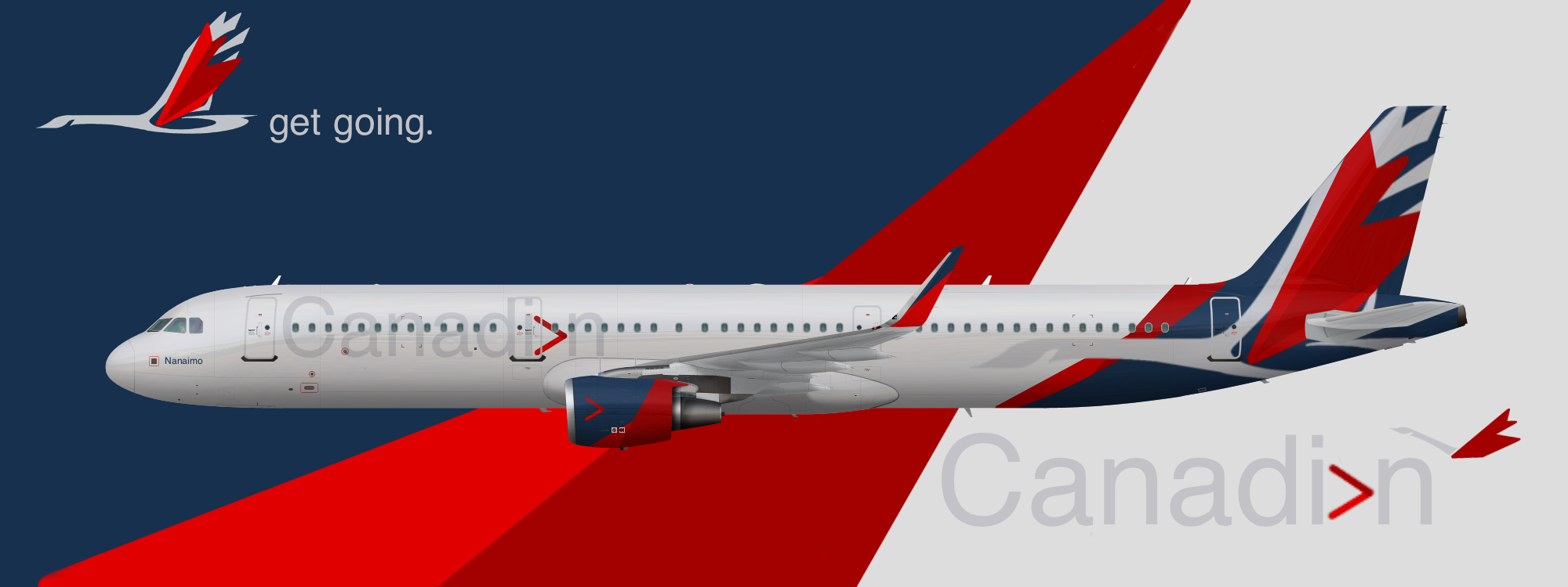
Concept livery for Canadian’s A321. Note: It is and was never my intention to copy or imitate anyone else’s work. Any resemblance to another user’s work is strictly coincidental.
Aircraft Name: Nanaimo
Note: please be nice, I only just started designing. Would love to hear some feedback though 
Template from Med.


not bad although i suggest making the goose and the titles a darker shade of grey to allow it pop out from the fuse
Noted. I was trying to go for an effect similar to the SAS titles in their new livery.


Oh shoot. I swear I didn’t see that until today. Sorry for the resemblance, I was just trying to add a maple leaf to the previous goose logo.

Love this, though IMO the titles should be either dark grey or blue. Though if you're going for that SAS effect, maybe duplicate the effects layer and mask it to the text for that metallic look! 
One more thing though, is the logo the Chevron or the Goose? I feel like there's 2 logos here.
Love this, though IMO the titles should be either dark grey or blue. Though if you're going for that SAS effect, maybe duplicate the effects layer and mask it to the text for that metallic look!
One more thing though, is the logo the Chevron or the Goose? I feel like there's 2 logos here.
The primary logo is the goose, however I kept the chevron as a secondary logo. Also, fun fact, the chevron is positioned in place of the third a in Canadian so that they wouldn't have to change the spelling for the two languages since Canadian in french is Canadien.


not bad although i suggest making the goose and the titles a darker shade of grey to allow it pop out from the fuse