
 Sign In
 Create Account


- Owner: Viperion101 (View all images and albums)
- Uploaded: Jul 14 2018 03:18 AM
- Views: 1,148
- Album Emerald Airlines

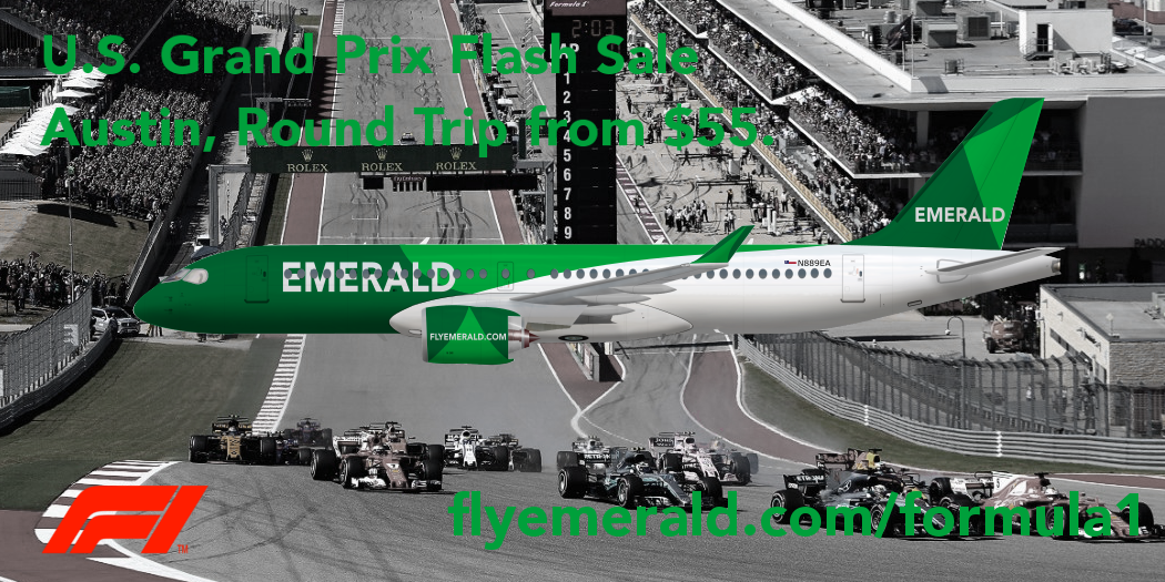
An example of a route the A220 would be used on.


I'm sorry but this is one of the worst brands I've seen in a while. I'm offended by how badly the use of Formula 1 is in this photo. Not to mention how badly put together this ad is.
Ad aside, the livery is just not doing it for me, or a lot of other people for that matter.
- It's way too busy, trying to be flashy when it's actually doing the opposite, and being unappealing.
- What is this airline trying to be? Cause from my standpoint, it's definitely not a flagship carrier.
- Where's the storyline? This airline is just an empty shell on a beach somewhere. I can say for myself that 'empty' brands do not work.
So many new members fall into the belief that if they post stuff faster, it'll be better. That couldn't be farther from the truth. The faster you post, the crappier the work. It's plain and simple.
So, Viperion, take a second and hear me out. Take a break from this airline, go back, and actually take time to craft something nice. A livery should not take 15 minutes to make, it should take days, if not, weeks to make.

It's very green

There is too much going on in the background 


This ad is a great example of what not to do... contrast, hierarchy and white space are priceless when conveying information.
Try again.
Edit: Vision speaketh the truth.


