In recent it has come to my attention that there have been some questions about Auxiliary branding and people who really have no idea of what they are doing when the branding leaves the aircraft. But hopefully with my little tutorial here I will be able to help some people out in improving their brand. As I am sure that people will want to reference this later as I am positive that this will eventually get buried underneath a mountain of things I will post a link to it on my bio for everyone to look at ![]() If you have any further questions feel free to message either here or discord if applicable.
If you have any further questions feel free to message either here or discord if applicable.
Now down to business. This will be our key for this little project
1. What is Auxiliary Branding?
2. Why is Auxiliary Branding Important?
3. How to properly prepare to create auxiliary branding pls examples
4. Execution of a print advertisement
5. Closing thoughts for pt 1
1. What is Auxiliary branding?
Auxiliary branding is a term that can be used for pretty much everything besides the logo and the paint on the plane. Such as the placards you see directing you through a queue with the airlines branding on it, the lounge branding, advertisements (such as billboards, print adverts ect) and safety cards and magazines provided for passengers.
2. Why is it important?
Now the Importance of these things vary. Advertisements lure customers into your aircraft to travel to various destinations around the word and can provide a edge over the competition if done right. While safety cards are a requirement for every aircraft and should be able to blend into your interior and airline branding. While people look at things like menus salt shakers and other little things as not very important small touches can make a whole world of difference in the world of aviation. Things like using metal cutlery instead of plastic and having on brand amenities can change the way perspective and current customers look at your brand (hopefully for the better) and most of these small touches can be made fairly easily in any photo editing software.
3. Now... What do we need to do to get started?
This will be part one where we focus on the advertising part as I am sure this is what people will be more interested in. but we will be doing more auxiliary branding as I find the time to write these tutorials and as I myself learn how to do some of these things. So welcome to part 1 of 3!*
DO YOUR HOMEWORK!!!
this is going to be the most important thing here. You NEED to know who you are advertising too. Would large groups of people from Russia want to go to Guadalajara? Would people from Isreal want to go to Pakistan? The reason I say this is because these little details could make or break your advertising. Same thing goes for simple things like Menus and even airport and lounge signage. In the end it all has to make sense for where your airline is located, your destinations and your customer base.
In the case of this tutorial we will be working on branding for my airline SAB Sistema Aero Brasileiro and I will walk you through the creation of a advert and some auxiliary branding but first we will be looking at some branding from my friends on the website and explain why these things work as well as they do.
Some Examples
1. Mokupuni, DC-10 Advert - Airplano21
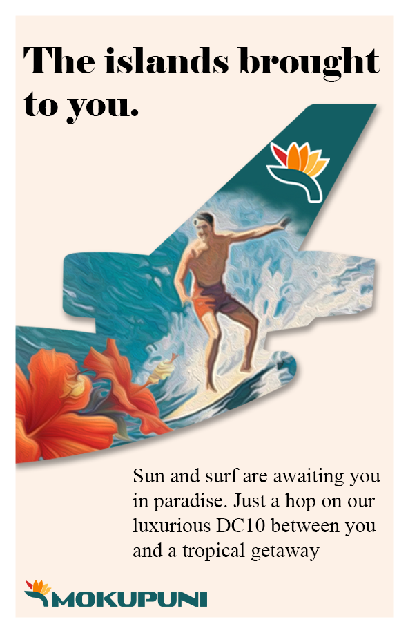
Now the first question you should be asking yourself is why this advertisement works so well before you keep reading this. Even without knowing this airline you should get a very good idea of where they are based and which demographic of people they are targeting with this.
Now to break down why this works so well
First thing to note... This advertisement would work just as well with text as without. The first thing you see is a guy surfing with some tropical flowers inside of the silhouette of a DC-10 clearly showing this to be a airline of tropical origin. The other thing that can be differed from this without the text is that this airline is clearly targeting holiday makers. Giving them just a little taste of what might be awaiting them when they travel to Hawaii.
Now with the text it is very simple and to the point. No long explanations about things that do not really apply to the airlines main points they are trying to get across in this advertisement... They use your imagination to do most of the talking for them using bright colorful images of waves and flours to get your mind wandering and only using text to initially draw the eyes in and finish their point.
And this brings me to one of my first major point. Too much text is a bad thing in advertisements. If your driving 75 on the freeway you will not be able to make out a point about how great Mexico City is. You will just be able to see a stunning picture of the city and some text saying which airlines ad it is in the first place. While with print advertising the same sort of thing applies, Someone who is reading a newspaper is going to be skimming through the pages looking for something they want to read your advertisement has to stand out from that so they remember it but not so long winded that they don't take the time to see what you have to offer.
My one major exception to this is in Magazines... Airlines tend to use a lot of their magazine space to advertise their destinations and services in more detail. Now this should more be about things to do in the destination... Fun out of the way things ect. (EX in our case with SAB: Instead of talking about something almost everyone knows about like Christ the Redeemer in Rio lets talk about the art, scenery and Architecture of Santa Teresa that lays a bit outside of the city center)
2. Sunwest, #GetFunked Campaign
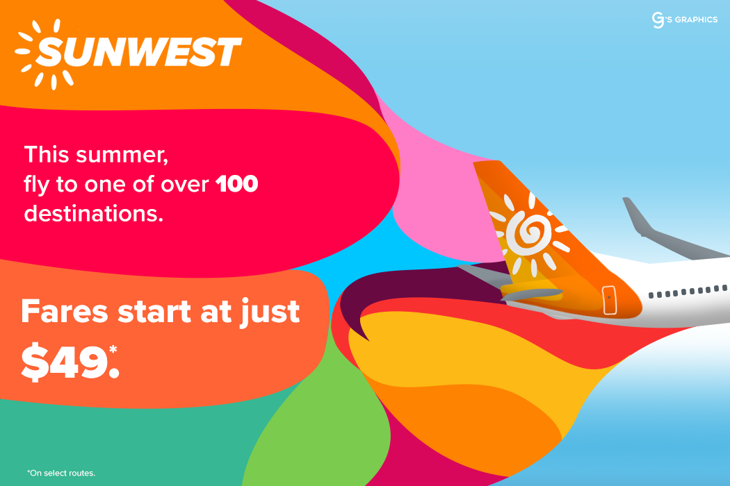
Again I want you to ask yourself what you see here. If you were someone scrolling through their Instagram feed or mindlessly browsing the internet and you saw the above advertisement what would you be able to differ from it? Take a second to absorb what GJ did with this colorful advert here and in your head figure out why you think this is such a good advertisement,
a second,
Alright so the first thing that should be noted here is the colors, they are very bright and vivid, this is good because it will catch your eye as you scroll through looking at random things (I am not sure if this is a social media add but I am using it as a example of one)
The second thing that should be taken from this is the use of bold text. The first things you will be drawn too are the "Fares stat at just $49." peaking your interest and getting you drawn further into the advert and possibly even into buying a ticket for one of these flights.
Another thing to note about this advertisement is the *on select routes small print in the corner. Looking through most advertisements this is something that is very common among all types of advertising. And putting things like this in the right types of advertisements can add some nice detail where there was none before. I should also note that this advertisement is clearly targeting a specific demographic, Families and Young Adults who are trying to get away for summer break who might not want/have the money to spend on seats on a legacy carrier while also showing to them that your airline might be the fun less expensive option while they are trying to travel somewhere.
3. Alpine Airways, Need a Getaway?

Now last but not least for the examples we have a billboard for a Austrian/Swiss Based airline advertising service to Zurich and Vienna. This covers a lot of the points I made with Mokupuni. Simple and to the point, driving past this billboard on the freeway you will gather everything you need to know from it with just a quick glance. Not much else really needs to be said about this other than this is a prime example of what a billboard should look like.
Although I will add that it might be a smart option to make the website a little bit bigger so its more visible from the road
Now I know I should not need to say this but again these are examples! Make something creative and don't just follow what these guys did to a T
4. Execution
Now we have made it to the fun part of this. Making something for ourselves, again as stated before we will be using my Brazilian carrier SAB for this example.
First things first lets figure out what we want to advertise here, our fancy new plane? A new destination being added? Or maybe even a brand new lounge for the airline?
In this case we will be advertising one of SAB's newest aircraft the Airbus A350-900 which will first be used on SAB's service Chicago Illinois for Rio, The first new route for the airline into the USA without utilizing the help of their codeshare partners. This ad will be print and found in newspapers in Brazil.
Now that we know what we are doing we will move onto the execution of the advertisement.
First things first we need to decide what kind of advert this is? I know I said it above but this is a great step into making a great advertisement. But again as I said before this will be a full page advertisement in a magazine distributed in Brazil.
And now a very crucial part is what language will we be printing this advertisement in? Since we know our demographic is in Brazil we will be writing ours in Portuguese.
now lets hop into Photoshop (or your prefered editing software but for this case I will be using Photoshop as that is what I know how to use)

Ok so we now have our Photoshop opened, For this case I will be using a 591 x 915 px document. Depending on what you decide to do this will vary in size but since its a page advertisement this sort of paper size document will work best for me.
Now onto the most important part... What you are advertising. In my case it is going to be the new A350-900 introduced in 2019 so I will be using a template to represent this brand new aircraft.

Heres the Aircraft I will be using for this.... I will also use this time to open up all of the other things I need, Logos and other branding your airline would display with one of their advertisements.

Now Im going to move it over into the document we chose for this... This is when we really set up what our advertisement will look like, now mind you the plane is too large to see most of the details we want in this advert so lets resize it again.

Now while we are adding our image/plane/graphic to our advert lets also add some color to this, I will be using SAB's secondary color for the background and throwing some light grey to simulate a floor underneath the planes.
Now we need to think of something to say to grab peoples attention. For sab I will be saying "Algo novo esta chegando!" as the attentiong grabber which translates to "Something new is coming!"

Ok so now we have our attention grabber in place. I have added a slight blue gradient to break up the solid colors... this will come into play again in a moment.
now to spice it up a little bit...

Here I have added some SAB logos over top of the blue gradient, I will soon lower the opacity of to make it blend into the background more. Here we will also figure out what we will say in our main body text. In mine I will talk about some of the new destinations we will be serving with our new aircraft.


Ok so now we have some detail and our main body of text placed within the advert. This should be somewhere that is centered and fully visible. Now we move on to the fine details, SAB is a UW member airline so I will be adding that but you can really fill the bottom space with whatever you may like. I will also be cropping a bit off of the bottom so the advertisement better fills up the page.

Here besides the UW logo and text I have added the website and some small print. The small print should be just legible.
And with that we conclude part one of my little series here but this will not be the last part... Next time I get the time to write out a full one of these posts we will be talking about the website/app sides of things and how to design those and get them to fit onto ipad cut outs ect. Then in the third part we will be doing things like airport busses, signs and other misc items.
Thanks again for reading if you have made it this far. Feel free to ask questions or input in the lower section of the selected forum!
~BFS
*Subject to change as my time fluctuates.

 Sign In
 Create Account


 Back to top