
 Sign In
 Create Account

So I made this quite some time ago with Medviation's 757...
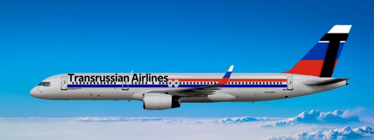
Any thoughts on it? I'm open to any in case I end up going through with another livery I plan to make.


So I made this quite some time ago with Medviation's 757...
Any thoughts on it? I'm open to any in case I end up going through with another livery I plan to make.
Aviation Enthusiast

This is not a terrible start but it could use some improvement. Your big bold text suggests this is a recent livery probably post 2000s but the blocky lines look significantly more dated, depending on which period you intend for your livery I would suggest changing your typeface or turning the fuselage lines into those large swoopy curves modern designers love so much. I also think your tail could use a little work, I assume the airline is a Russian outfit so I would suggest cribbing a bit from one of their smaller carriers or if you can't think of anything good, you could just pull the lines from the fuselage up to the tail. I really like the winglet, good work.


0 members, 0 guests, 0 anonymous users
 Back to top


