Sign In
 Create Account
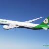
I worked on somewhat redesigning the America West livery and placed it on an A321. Please let me know how it looks. What looks good and what could improve? Thanks
Attached Files
-
 AmericaWest_A321.jpg 38.75KB
2 downloads
AmericaWest_A321.jpg 38.75KB
2 downloads


I worked on somewhat redesigning the America West livery and placed it on an A321. Please let me know how it looks. What looks good and what could improve? Thanks
AmericaWest_A321.jpg 38.75KB
2 downloads
Bad m*****f*****

Let's start by asking why you decided to do the things you did
Well, I wanted to keep roughly the same colors and logo, but I wanted to make it more modern looking I guess. I wouldn't be able to give specific reasons on anything though.
Bad m*****f*****
Okay I think that's your first mistake.
"Design" implies you put thought into what you did, and at the highest levels that means justifying every little detail you put into your design. You don't have to go that hard, but every time you decide to put ink onto paper ask yourself "why do I need to do this?". It's more time consuming, but trust me it yields better results than just kinda arbitrarily drawing things.
Beyond that I think the font choice is interesting, not the best choice given the rest of the design, but interesting.
AE Addict To-Be

the color swoop is a nice update, the titles are ghastly.
Don't stretch the registration out so much and make it realistically big.
You have a good base to work with, don't overthink it.
the color swoop is a nice update, the titles are ghastly.
Don't stretch the registration out so much and make it realistically big.
You have a good base to work with, don't overthink it.
Yeah I agree the color swoop is very nice, but like is said here the font is not the best choice. It is more modern than the previous font but it still doesn't really fit. And yeah the registration is out of proportion. But I like the base of the livery it's a nice update like is said here.
Thanks guys for the helpful tips!!

The O.G. Savage

 6
6

 3
3
I feel the font is very off for the titles, the concept is okay, however.


0 members, 0 guests, 0 anonymous users
 Back to top