Logo / Livery - Amadeus Airlines
#1
Posted 07 May 2012 - 05:23 AM
As we receive newer airplanes, we feel it's necessary to refresh the brand to match with newer planes.
Amadeus Airlines Boeing 747 wb.jpg 73.64KB 3 downloads
AA A330 WB.jpg 75.26KB 2 downloads
AA E-195.jpg 70.79KB 4 downloads
Here's the logo
AA - Logo2 1750x500.jpg 99.66KB 5 downloads
AAConnect - Logo 1750x500.png 85.29KB 5 downloads
We look forward for masterpiece design from talented designer in the forum.
Thank you.
#2
Posted 19 May 2012 - 07:05 AM
#3
Posted 19 May 2012 - 09:27 AM
#4
Posted 19 May 2012 - 03:05 PM
#5
Posted 19 May 2012 - 03:31 PM
#6
Posted 19 May 2012 - 11:49 PM
#7
Posted 20 May 2012 - 12:31 AM
how did you do such amazing liveries?
in case you're not aware, it's a copy of American Airlines livery
you can also try making your own following awesome tutorial by AgreMeister
I'm not quite sure, I kinda like bird logo on an airline logo.Do you want an entirely new logo ?
I've completed a couple of quick drafts/concepts but the AA scheme is one tough cookie to redesign. Any of these interest you?
THANK YOU SO MUCH 4E, these are ABSOLUTELY AWESOME!!!
my words fail me now, i never been that creative..
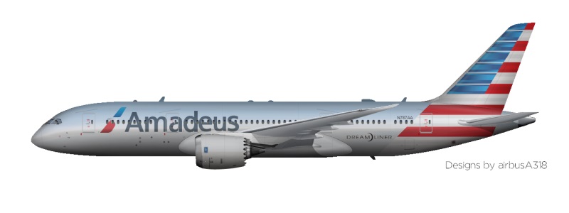
but since you put it in an Airbus, it looks more like French airplane than American airplane, lol..
can you make it more American, in an American quad-engines..
my favorite is #1 design, maybe a bit of swoosh in the aft of plane like #2 design?
it's indeed really tough to redesign this classic livery, even in real life this one never change
but I heard they are in the process to update the current livery..
how about this kind of ornamental tail in AA scheme?
#8
Posted 20 May 2012 - 10:49 AM
#9
Posted 20 May 2012 - 01:35 PM
but in the airbuses try to Merge the first livery and the last livery.
#10
Posted 20 May 2012 - 02:42 PM
#11
Posted 20 May 2012 - 02:50 PM
#12
Posted 20 May 2012 - 02:55 PM
I'm going to be brutally honest, 4E, I can't believe you're willfully claiming this to be your work. I'm aware they're only drafts but god they're hideous. I mean what were you thinking when you had the idea of sticking a stripe straight through the eagle on the tail of that 744?
And you had no idea some of yours were hideous? Everyone has something which looks hideous, for sure.
I think 4E's implementation is somewhat unique.
#13
Posted 20 May 2012 - 03:00 PM
And you had no idea some of yours were hideous? Everyone has something which looks hideous, for sure.
I think 4E's implementation is somewhat unique.
There's things that perhaps don't win everyone's hearts, and there's things that are pretty much criminal. This actually makes me want to smack the living daylights out of 4E.
#14
Posted 21 May 2012 - 03:57 AM
I like 4E's livery.
#15
Posted 21 May 2012 - 08:10 AM
Really? I think its awful.I honestly think either SB is the biggest troll ever in existance, or he's an a$$
I like 4E's livery.
Theres still a white square where you have pasted the star alliance logo.
Also, the star on there looks tacky - it would be better to integrate it into a proper logojet.
Porn in spoiler:
#16
Posted 21 May 2012 - 08:29 AM
How about something like this?
uhmm.. i think we already in the right direction with the swoosh, but the bird logo over the swoosh looks not quite right..
i'm really sorry for the hassle, this one is really a tough cookie to redesign..
maybe it will look better without the logo on tail?
thank you for your time 4E, look forward for your masterpiece design..
something like this
Lufthansa 747.jpg 170.8KB 0 downloads
DCNMQ.jpg 127KB 0 downloads
#17
Posted 21 May 2012 - 09:07 AM
Which one, to be exact? Some are marginally good, some are okayish and some are awfulThere's things that perhaps don't win everyone's hearts, and there's things that are pretty much criminal. This actually makes me want to smack the living daylights out of 4E.
Really? I think its awful. Theres still a white square where you have pasted the star alliance logo. Also, the star on there looks tacky - it would be better to integrate it into a proper logojet.
Unfortunately, I've to agree with bolli's example
#18
Posted 21 May 2012 - 09:20 AM
I honestly think either SB is the biggest troll ever in existance, or he's an a$$
I like 4E's livery.
My appologies for being passionate about design
#19
Posted 21 May 2012 - 11:45 AM
Speedybirdy, with all due with respect (which in my opinion is very, very little) your an f-wad, and I object to the fashion in which you've shared your views. Please indicate or demonstrate to me in what way 'god they're hideous' or 'is pretty much criminal' is constructive criticism?
I've attempted to create a series of alternate paint schemes that gives my 'client' a small array of various options from which to mix and match. Unlike yourself, my role as a designer is to meet the brief, not to design a brief of my own along the way, and people like choice, not your get-what-your-given type scenarios.
With regards to the eagle/stripe.... I was just playing around with the tail. I was finding it difficult to incorporate the 'swoosh' and the AA lettering without dropping the 3 tone scheme. This was the next livery I was planning on posting, which doesn't take into account your recent post Amadeus, but I will incorporate your ideas into my next post I've also included one with american titles, just for show
#20
Posted 21 May 2012 - 12:07 PM
You've been asked to include a 'swoosh' or so to speak, with a series of 'examples' included. Look at these examples. What do they all have in common? What's missing from all of them? Oh yes, a logo!
Don't get me wrong, they all convey the brand in their own way, but I wouldn't class them as a 'logo'. I'm sure you're able to comprehend that.
I don't make my own brief's up. I simply work around them. Nowhere in the 'brief' did it state the AA logo had to be retained on the tail. Never, ever, will it work, sticking a rather harsh, 'rigid' logo like AA's over the top of a 'swoosh' like the one you've created. Had you added a series of other swooshes, ultimately creating some sort of detailed pattern over which the logo, when in white or another non saturated tone which opposes the background shade, was placed, then that may have worked.
As I've attempted to imply in my posts, I can't believe someone like you would have posted those designs.
0 user(s) are reading this topic
0 members, 0 guests, 0 anonymous users