Jump to content

Photo

Speed Bird - Airline Brand Consultancy


  • Please log in to reply
100 replies to this topic

#1
Speed Bird

Speed Bird

    AE Addict

  • Member
  • 866 posts

User's Awards

7   
Livery for Moldova's airline, Svenska Swedish Airlines.

'Eurowhite', if used correctly, can indeed work, as is the case here. The bold logo placed upon the tail, featuring a metallic finish, expresses quality and sophistication in a subtle manner. Likewise, the typeface in which 'Swedish' is written is rather refined, yet still retains the more classic feel, signalling an impression of modernity but also elegance too. The colour is balanced uniformly across the aircraft with the thin band of metallic blue placed upon the engine, and the similarly presented crown logo on the pair of striking sharklets, enabling the usage of the lighter tone for the airline name. It is presented in the so-called 'billboard' fashion, which can often appear somewhat 'shouty' and 'over the top', however in this instance, combining the light grey tone and the typeface mentioned earlier, the name is much more visible, yet does not appear 'in your face'.

I present to you therefore, a 'eurowhite' livery, that does indeed very much so work in the context of a chic, sophisticated, modern day flag carrier.


Posted Image

One a side note, thank you greatly, Yuxi, for refusing to re-opening my old thread.

#2
Stevphfeniey

Stevphfeniey

    Bad m*****f*****

  • Member
  • 4,249 posts
  • Website:http://stevphfeniey.tumblr.com/
I must admit, it's very Scandinavian in its simplicity

please don't kill us we're just the aquabats


The Best Discord Server


#3
Air Scotland

Air Scotland

    Random Scot set on destroying the earth

  • Member
  • 633 posts
:drool: very slick although that crown onthe tail looks like the one on google images otherwise it is just amazing :drool:

if used correctly, can indeed work, as is the case here.

very self-centered arent you :P you're right though :P

International Airlines Group

1950s.pngLogo.png


#4
X-Wing @Aliciousness

X-Wing @Aliciousness

    I think you'll like them!

  • Member
  • 1,760 posts
  • Website:https://my.flightradar24.com/agremeister
So many airlines try and fail to use eurowhite these days (The new Swiss livery and BA spring to mind) that it really doesn't work anymore, even if done tastefully.

I do like the livery, but in the context of the real world it fails to differentiate itself. :/

UbxSbIt.png


#5
Guest_rojo.grande_*

Guest_rojo.grande_*
  • Guests

Too many airlines try and fail to use eurowhite these days (The new Swiss livery and BA spring to mind) that it really doesn't work anymore, even if done tastefully.

I do like the livery, but in the context of the real world it fails to differentiate itself. :/


:popcorn: :rofl: XD

#6
X-Wing @Aliciousness

X-Wing @Aliciousness

    I think you'll like them!

  • Member
  • 1,760 posts
  • Website:https://my.flightradar24.com/agremeister
Ross, Honestly, What the f**k?

UbxSbIt.png


#7
Speed Bird

Speed Bird

    AE Addict

  • Member
  • 866 posts

User's Awards

7   
I'd certainly contest that BA's 'failed'; in my opinion it's the most elegant modern livery out there today. The way they've displayed the Union Flag, incorporating the soft curvature as though the flag is indeed flying, expresses the true Britishness of the airline but in a manner that is not perceived as harsh or imposing. Polite is a way I'd describe it. It also of course is a modernization of the original Negus tail design used by the airline. And then the logo itself at the front of the aircraft; an absolute masterpiece frankly. It's such a classy re-incarnation of the Speed Bird, turning something as soft and insignificant as a piece of ribbon into the world famous, iconic logo used by one of the world's most prestigious airlines. The Speed Bird was such an iconic symbol in British aviation, and the fact it's still in use in a new, revitalized form today is an indication of the transformation and adaption the airline itself has been through, but shows it's roots have certainly not been forgotten. For me, BA's current livery is utterly perfect. I've been asked in the past to have a go at redesigning their livery, and every time, I refuse purely on the grounds I don't believe a better job can be done. There's no better example of the cross between elegance and contemporary design in civil aviation today.

Even with Swiss, I'd disagree with you. I like to describe contemporary design as 'miminalistic'. White is a key part of that. It's clean, and most importantly it gives the impression of sophistication. Hence the reason many flag carriers today utilize white to the extent that they do. However, adding colour to this can then change the mood. Typically you want to stick to the use of one colour alone; several different bright colours will of course clash (that's usually the case of course; if executed properly, it can work though), but in doing so, you can give a completely different impression to the person viewing said piece of work, making the use of colour so important. It's getting the correct impression that's the hard part.

There are of course so many other factors; I could go on for hours about this. But to say BA and Swiss have failed to use eurowhite is ludicrous. I'll also add to the list of airlines that have indeed pulled it off very well are Finnair and Virgin Australia, two airlines who's intended images are expressed brilliantly with their new liveries, and hence, the reaction from other aviation enthusiasts about those liveries astounds me.

I would however agree some recent eurowhite liveries have been utterly appalling; certainly Spanair's final livery would come under that category.

#8
Guest_rojo.grande_*

Guest_rojo.grande_*
  • Guests

I'd certainly contest that BA's 'failed'; in my opinion it's the most elegant modern livery out there today. The way they've displayed the Union Flag, incorporating the soft curvature as though the flag is indeed flying, expresses the true Britishness of the airline but in a manner that is not perceived as harsh or imposing. Polite is a way I'd describe it. It also of course is a modernization of the original Negus tail design used by the airline. And then the logo itself at the front of the aircraft; an absolute masterpiece frankly. It's such a classy re-incarnation of the Speed Bird, turning something as soft and insignificant as a piece of ribbon into the world famous, iconic logo used by one of the world's most prestigious airlines. The Speed Bird was such an iconic symbol in British aviation, and the fact it's still in use in a new, revitalized form today is an indication of the transformation and adaption the airline itself has been through, but shows it's roots have certainly not been forgotten. For me, BA's current livery is utterly perfect. I've been asked in the past to have a go at redesigning their livery, and every time, I refuse purely on the grounds I don't believe a better job can be done. There's no better example of the cross between elegance and contemporary design in civil aviation today.

Even with Swiss, I'd disagree with you. I like to describe contemporary design as 'miminalistic'. White is a key part of that. It's clean, and most importantly it gives the impression of sophistication. Hence the reason many flag carriers today utilize white to the extent that they do. However, adding colour to this can then change the mood. Typically you want to stick to the use of one colour alone; several different bright colours will of course clash (that's usually the case of course; if executed properly, it can work though), but in doing so, you can give a completely different impression to the person viewing said piece of work, making the use of colour so important. It's getting the correct impression that's the hard part.

There are of course so many other factors; I could go on for hours about this. But to say BA and Swiss have failed to use eurowhite is ludicrous. I'll also add to the list of airlines that have indeed pulled it off very well are Finnair and Virgin Australia, two airlines who's intended images are expressed brilliantly with their new liveries, and hence, the reaction from other aviation enthusiasts about those liveries astounds me.

I would however agree some recent eurowhite liveries have been utterly appalling; certainly Spanair's final livery would come under that category.


I honestly agree with this :| I have nothing else to say...


However, Swiss' new text annoys me a lil. Its too plain.

#9
SirMoo

SirMoo

    Rawr?

  • Member
  • 497 posts
I have a few complaints (comments?) on the Svenska Swedish Airlines ones. While I like the idea and concept, the way parts are executed seem to not give the full 'umph' that I want to feel from it.

For one, I'm not a fan of the silver/gray. The fade from the silver to the white seems to imply more of a depressing feeling since you're suddenly hit by the blue. And while I love the crown, I feel the angle that you have it in seems to make it more of a puzzle piece and it's hard to really see what you're going for. It's almost like blue blobs that come down to a pointy edge. I'd like to see the crown a bit more defined. I do like the gray and blue accent lines on the engine as well as the crown on the wing ends. The plane seems a bit more depressing than it should be.

My least favorite thing about it all... The ® actually on the plane. I fail to see the need for that.

#10
X-Wing @Aliciousness

X-Wing @Aliciousness

    I think you'll like them!

  • Member
  • 1,760 posts
  • Website:https://my.flightradar24.com/agremeister

I'd certainly contest that BA's 'failed'; in my opinion it's the most elegant modern livery out there today. The way they've displayed the Union Flag, incorporating the soft curvature as though the flag is indeed flying, expresses the true Britishness of the airline but in a manner that is not perceived as harsh or imposing. Polite is a way I'd describe it. It also of course is a modernization of the original Negus tail design used by the airline. And then the logo itself at the front of the aircraft; an absolute masterpiece frankly. It's such a classy re-incarnation of the Speed Bird, turning something as soft and insignificant as a piece of ribbon into the world famous, iconic logo used by one of the world's most prestigious airlines. The Speed Bird was such an iconic symbol in British aviation, and the fact it's still in use in a new, revitalized form today is an indication of the transformation and adaption the airline itself has been through, but shows it's roots have certainly not been forgotten. For me, BA's current livery is utterly perfect. I've been asked in the past to have a go at redesigning their livery, and every time, I refuse purely on the grounds I don't believe a better job can be done. There's no better example of the cross between elegance and contemporary design in civil aviation today.

Even with Swiss, I'd disagree with you. I like to describe contemporary design as 'miminalistic'. White is a key part of that. It's clean, and most importantly it gives the impression of sophistication. Hence the reason many flag carriers today utilize white to the extent that they do. However, adding colour to this can then change the mood. Typically you want to stick to the use of one colour alone; several different bright colours will of course clash (that's usually the case of course; if executed properly, it can work though), but in doing so, you can give a completely different impression to the person viewing said piece of work, making the use of colour so important. It's getting the correct impression that's the hard part.

There are of course so many other factors; I could go on for hours about this. But to say BA and Swiss have failed to use eurowhite is ludicrous. I'll also add to the list of airlines that have indeed pulled it off very well are Finnair and Virgin Australia, two airlines who's intended images are expressed brilliantly with their new liveries, and hence, the reaction from other aviation enthusiasts about those liveries astounds me.

I would however agree some recent eurowhite liveries have been utterly appalling; certainly Spanair's final livery would come under that category.


Well I do disagree on BA's livery, I did think Swiss's old livery was quite good. I just beg the question, have you seen the new one?

Old:
Posted Image

New:
Posted Image

The removal of the "Block" logo from the engines and the change of the fuselage writing has really gone from tasteful minimalism to boring, average eurowhite.

UbxSbIt.png


#11
Speed Bird

Speed Bird

    AE Addict

  • Member
  • 866 posts

User's Awards

7   
Why would the aircraft not have a reg, SirMoo?

And no, Agre, I'm commenting on Swiss' livery without actually having seen it :P

#12
X-Wing @Aliciousness

X-Wing @Aliciousness

    I think you'll like them!

  • Member
  • 1,760 posts
  • Website:https://my.flightradar24.com/agremeister

Why would the aircraft not have a reg, SirMoo?

And no, Agre, I'm commenting on Swiss' livery without actually having seen it :P


Well I wasn't sure if you were referring to the new one or the old one :P

UbxSbIt.png


#13
SirMoo

SirMoo

    Rawr?

  • Member
  • 497 posts

Why would the aircraft not have a reg, SirMoo?

Err. ® is the code for registered trademark. ® Is not needed on the plane itself. I think they just look messy. I wasn't meaning the plane registration.

The removal of the "Block" logo from the engines and the change of the fuselage writing has really gone from tasteful minimalism to boring, average eurowhite.

Indeed... It's much more boring now.

#14
Speed Bird

Speed Bird

    AE Addict

  • Member
  • 866 posts

User's Awards

7   
I've noticed recently it's becoming increasingly common on liveries these days, notably JetBlue have incorporated it into the logo on their new livery. Personally I think including it makes the design appear complete. Personal preference to be honest.

#15
Guest_rojo.grande_*

Guest_rojo.grande_*
  • Guests

I've noticed recently it's becoming increasingly common on liveries these days, notably JetBlue have incorporated it into the logo on their new livery. Personally I think including it makes the design appear complete. Personal preference to be honest.


very very true...

#16
Alfrenzo

Alfrenzo

    Probably retired

  • Member
  • 861 posts

User's Awards

2       6    3   
Honestly, it looks distasteful if your trademark background ain't there.

noelair%20banner.png


#17
sviridovt

sviridovt

    AE King

  • Member
  • 1,512 posts
  • Skype Name:tim.sviridov
  • Website:http://www.tech-central.org

Well I do disagree on BA's livery, I did think Swiss's old livery was quite good. I just beg the question, have you seen the new one?

Old:
Posted Image

New:
Posted Image

The removal of the "Block" logo from the engines and the change of the fuselage writing has really gone from tasteful minimalism to boring, average eurowhite.


I dont like the these series of new liveries with eurowhite (the new JAL and this). They are going for minimalist look, but it ends up looking just plain white and too similar to each other (and the old swiss livery was better in my opinion (it was both minimalist yet elegant at the same time)) the new liveries just fail.

#18
4Engines

4Engines

    Australian Livery King

  • Member
  • 235 posts

... Likewise, the typeface in which 'Swedish' is written is rather refined, yet still retains the more classic feel, signalling an impression of modernity* but also elegance too.


I present to you therefore, a 'eurowhite' livery, that does indeed very much so work in the context of a chic, sophisticated, modern day flag carrier... if I do say so myself :P


- One a side note, thank you greatly, Yuxi, for refusing to re-opening my old thread.


Alright shakespeare, thanks for another thrilling epic :P By the way, I believe modernism* was the one you were after, not the transitional period in history from feudalism to capitalism seen in the west from the 1500s until the late 1900s :B And by the way cute passive aggressive sign off :rofl:

Anyways, now that the formalities are over and done with, ( Lots of love, :wub: :D ), I quite like the design! Low key, neat, but bold and refined!


And while I love the crown, I feel the angle that you have it in seems to make it more of a puzzle piece and it's hard to really see what you're going for. It's almost like blue blobs that come down to a pointy edge. I'd like to see the crown a bit more defined. I do like the gray and blue accent lines on the engine as well as the crown on the wing ends. The plane seems a bit more depressing than it should be.

My least favorite thing about it all... The ® actually on the plane. I fail to see the need for that.


I agree on most points, despite the excellent overall feel. Particularly on the issue of the crown... personally I think it's great, but when I scanned quickly over the image (I was intent on moving on to chapters 4 and 5 in your second novel post XD ) it didn't even occur to me that it was the same crown as on the logo (If a crown at all). Takes a minute to wrap the head around :/ I don't think it needs to be more defined... perhaps just rotated a tad?

With regards to all the aforementioned airlines, a quick, average, Joe Bloggs assessment :
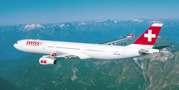
  • Old Swiss (Block on fuselage/engines) looks around 10 billion times better than the new one. That A340 is beautiful....
  • Virgin Australia is :sick: and will definitely take time to get used to, much like the new JAL livery (FFS, really? really JAL???)
  • Finnair just managed to pull off eurowhite, their aircraft are still extremely bland. They just don't look complete!
  • British Airways have a brilliant, timeless livery. However, let us not forget the one and only....
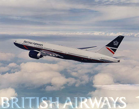

Posted Image


.... Landor 777... :wub:


westernpac.jpg


#19
Speed Bird

Speed Bird

    AE Addict

  • Member
  • 866 posts

User's Awards

7   

Alright shakespeare, thanks for another thrilling epic :P By the way, I believe modernism* was the one you were after, not the transitional period in history from feudalism to capitalism seen in the west from the 1500s until the late 1900s :B And by the way cute passive aggressive sign off


I'd just like to say I think you're talking bull**** there :P Both words, based upon their definition, are appropriate in this instance. Perhaps the use of the word 'classic' lead you to believe my words concerned this transitional period. But I don't see an issue with what I've written. Like I say, I've just been to check the exact definition of both words, with my conclusion being that they are both appropriate. I admit 'modernity' is often used in a historical context, but there's no reason as to why it would be incorrect to use it in this instance.

In regards to the Landor livery, there is a reason I always go to their site to look for inspiration for my designs :P

#20
Guest_rojo.grande_*

Guest_rojo.grande_*
  • Guests

I'd just like to say I think you're talking bull**** there :P Both words, based upon their definition, are appropriate in this instance. Perhaps the use of the word 'classic' lead you to believe my words concerned this transitional period. But I don't see an issue with what I've written. Like I say, I've just been to check the exact definition of both words, with my conclusion being that they are both appropriate. I admit 'modernity' is often used in a historical context, but there's no reason as to why it would be incorrect to use it in this instance. In regards to the Landor livery, there is a reason I always go to their site to look for inspiration for my designs :P


I like the landor livery but imo its always looked better on BA's older planes (L1011,Trident, Bac 1-11) vs the newer planes :)


0 user(s) are reading this topic

0 members, 0 guests, 0 anonymous users