Panamair A330
- Owner: USA (View all images and albums)
- Uploaded: May 03 2014 11:55 PM
- Views: 2,469
- Album AirshakUSA

Love the template so much ![]()
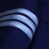
The front of the plane looks cramped and messy, and the curves are all over. They're all jagged and icky.
I like the concept, but execution was 0/10
I disagree.
THis is one of the best liveries he has made. There are issues but this blows Copa or Air Panama out of the water.
Improve, you can be even better
This is one of the best liveries he has made.
I have to disagree
There are issues but this blows Copa or Air Panama out of the water.
So much for Eurowhite.
I have to disagree
So much for Eurowhite.
You know, there is a reason him and other people rage quit.
Its because of s***ty and non constructive criticism.
Learn to give constructive criticism.
Really sick of this stagnation in the community.
I wasn't insulting him or anything. I was insulting Copa and Air Panama's bland Eurowhite livery.
This livery above is perfectly fine.
Should really learn to tell where comments are directed.
I was mearly saying, this isn't his best livery, his best was the one I linked.
Fancy shades of reds, enjoy the white line on the bottom of the fuselage, the white symbol is somewhat odd however and I think Panama Air should be more white instead of the light grey
The logo on is a bird
The way the logo is on the tail, I see it as a bird. in the "Panamair" above the plane, I see it as two oddly shaped triangles

 Sign In
 Create Account


The front of the plane looks cramped and messy, and the curves are all over. They're all jagged and icky.
I like the concept, but execution was 0/10