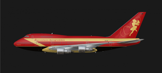
Diarcesiaces Aerogrammes Boeing 747SP, 1980s
- Owner: diarcesia (View all images and albums)
- Uploaded: May 27 2023 10:53 PM
- Views: 781
- Album Diarcesiaces Aerogrammes

The airline's regular livery on a Boeing 747SP during the 1980s.
Interesting
The color choice is poor, the design is not cohesive/does not compliment the aircraft, I cannot tell what the logo is, and I assume this is for a fictional country but the lack of context in the form of lore means that i am generally uncertain about anything that this livery represents.
The color choice is poor, the design is not cohesive/does not compliment the aircraft, I cannot tell what the logo is, and I assume this is for a fictional country but the lack of context in the form of lore means that i am generally uncertain about anything that this livery represents.
This is my first time building an aircraft's livery. I am also open to feedback on improving them. What are the general pointers in color choice and aircraft matching?
Fictional Country Context: The Diarcesian Monarchy is a Greco-Roman country that has a lot of historical influence from the Byzantine Empire of the 500s-600s AD. The flag's colors are dark red with gold accents. If placed on Earth, it could be a large breakaway European-based state from Byzantium with a Greek-Latin hybrid language and culture.
Airline Context: The logo is called "Hespera", a country-specific Anemoi figure from its Greek-derived mythology. She is depicted dancing and holding a lasso to give it a windy effect. The color choices are based on the country's flag.
The country is also known for its rail network, and the airline's liveries try to evoke train liveries as well.
The color choice is poor, the design is not cohesive/does not compliment the aircraft, I cannot tell what the logo is, and I assume this is for a fictional country but the lack of context in the form of lore means that i am generally uncertain about anything that this livery represents.
This is my first time building an aircraft's livery. I am also open to feedback on improving them. What are the general pointers in color choice and aircraft matching?
Gold in particular is a surprisingly hard color to properly replicate especially on a Med template. This is why not many people use it. A lot of the time, you also have to use gradients to achieve the metallic look of gold, which quickly becomes very complicated and it won't look good regardless if you don't have a good understanding of lighting.
Fictional Country Context: The Diarcesian Monarchy is a Greco-Roman country that has a lot of historical influence from the Byzantine Empire of the 500s-600s AD. The flag's colors are dark red with gold accents. If placed on Earth, it could be a large breakaway European-based state from Byzantium with a Greek-Latin hybrid language and culture.
Airline Context: The logo is called "Hespera", a country-specific Anemoi figure from its Greek-derived mythology. She is depicted dancing and holding a lasso to give it a windy effect. The color choices are based on the country's flag.
The country is also known for its rail network, and the airline's liveries try to evoke train liveries as well.
The added context helps a lot, I can tell what the logo is now. However, I don't feel that the lasso does its job of adding motion very well; the Anemoi figure has a dynamic pose which gives it a sense of motion already. The lasso, if anything, visually distracts the viewer from the figure, effectively breaking up the design. I would suggest removing the lasso entirely. Additionally, I would try and use the negative space to add dimension to the logo, similar to AviatorCJ's Liberty Airways. (This may be difficult with your current color choice.)
if you got rid of the rings around the figure and added shadows to it like gj said, i think it would look a lot better
V2:
- Made the lassos a tad thinner to not distract from the anemoi figure
- Changed the anemoi's head: added negative space to give definition and detail to it
There is a button to edit a livery instead of posting it again. The detail on the logo makes its shape much better. The colours I understand are from the flag but soaking plane in them is a bad look. There are several reasons most planes are mostly painted white but one of them is that it generally always looks good. I totally think you can use these two colours but together with black and having so much of them just does not look great. I would suggest looking at something like the Oman 747 SP VIP thing for inspo. Finally I would find a different font this one is quite bad Italian restaurant vibes.
I'll try to look for alternative fonts that gives the logo a lowercase handwriting-like quality.
V3:
- Changed airline name's font from Lucida Bright to Gelasio.
- Changed the aircraft registration to use FE-Schrift font to allow easy differentiation between Os and 0s.
The colours I understand are from the flag but soaking plane in them is a bad look. There are several reasons most planes are mostly painted white but one of them is that it generally always looks good...
I feel it's a great in-character angle in the airline's future design direction. I plan to release a Concorde livery based on this that is predominantly white. I can see the company using that as a basis for their standard 90s livery.
i love the font! if this is supposed to be a retro aircraft though, i think it would look better with the text in all caps. also i'm not really a fan of the yellow/black underbelly, but it still looks cool!

 Sign In
 Create Account


its certainly unique.