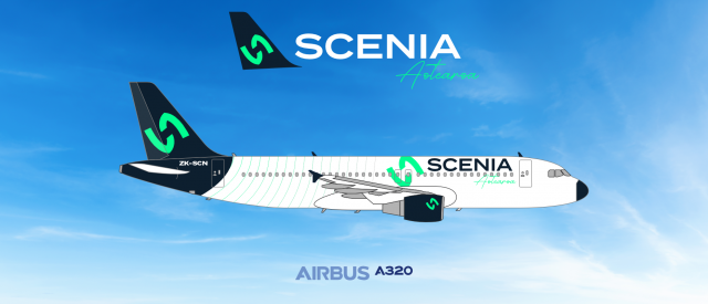
002. Scenia A320
- Owner: blanchecroix (View all images and albums)
- Uploaded: May 24 2023 10:44 PM
- Views: 815
- Album Constant Mediocrity by blanchecroix

This is my first plane, an Airbus 320.
The logo is generic and I'd be willing to bet you did not make it yourself
c'mon man this is low... at least provide some proof - a copied logo would be blurry and/or grainy
likewise, Westwind is just two w's from a font that surely you didn't design
I admire the ambition of this livery and for a first foray it's rather impressive. I would highly suggest using 3D style templates made by users like Medaviation and Airplano21 available on the forums of this very website - they'll make your work look much better. The colour scheme is fresh and works well for a smaller lower cost niche airline and the name is not a terrible fit either. The logo is generic and I'd be willing to bet you did not make it yourself - Even a basic polygonal logo of your own design will usually be better than something you found from the internet because your work will be made for your brand. Finally, I think the titles on the fuselage are too large.
Literally shut up, nobody wants to read all of that
This is lovely!
I admire the ambition of this livery and for a first foray it's rather impressive. I would highly suggest using 3D style templates made by users like Medaviation and Airplano21 available on the forums of this very website - they'll make your work look much better. The colour scheme is fresh and works well for a smaller lower cost niche airline and the name is not a terrible fit either. The logo is generic and I'd be willing to bet you did not make it yourself - Even a basic polygonal logo of your own design will usually be better than something you found from the internet because your work will be made for your brand. Finally, I think the titles on the fuselage are too large.
chris i appreciate you giving detailed feedback and all but it is a bit condescending and a smidge hypocritical
anyway in my opinion this livery is lovely just how it is, I could totally see this being a real thing
Nice work! I like it.
As others have said, for a first go, this is a really good livery. I just have a couple of thoughts about it. For one, outside of the "Aotearoa" text and the registration, I don't think I'd really be able to pinpoint where this is from. However, if this is intended to be an LCC, that's perfectly fine.
I'm also not entirely sure about the logo up front next to the text, I think the engine logo is enough in that area.
Also, I do agree with ThePessimist that the use of Med, Airplano or similar templates would potentially bring this livery to life a bit more. However, that's just a personal preference, and if you'd prefer to use the templates you're using now, then don't feel pressured to switch.
i like it. reminds me of lift from SA
I admire the ambition of this livery and for a first foray it's rather impressive. I would highly suggest using 3D style templates made by users like Medaviation and Airplano21 available on the forums of this very website - they'll make your work look much better. The colour scheme is fresh and works well for a smaller lower cost niche airline and the name is not a terrible fit either. The logo is generic and I'd be willing to bet you did not make it yourself - Even a basic polygonal logo of your own design will usually be better than something you found from the internet because your work will be made for your brand. Finally, I think the titles on the fuselage are too large.
Thanks for all of your inputs. I'll have all of these in mind for next ones.
I've been looking at the templates for a while, and I'm searching a way to open this in the software I use, since they are different types. About the logo, believe it or not, I did it myself. It turned out similar to the Crusaders rugby team, but that's the problem with trying to establish a New Zealander airline without being a kiwi.
Literally shut up, nobody wants to read all of that
This is lovely!
Thanks!
Nice work! I like it.
Thanks!

 Sign In
 Create Account


I admire the ambition of this livery and for a first foray it's rather impressive. I would highly suggest using 3D style templates made by users like Medaviation and Airplano21 available on the forums of this very website - they'll make your work look much better. The colour scheme is fresh and works well for a smaller lower cost niche airline and the name is not a terrible fit either. The logo is generic and I'd be willing to bet you did not make it yourself - Even a basic polygonal logo of your own design will usually be better than something you found from the internet because your work will be made for your brand. Finally, I think the titles on the fuselage are too large.