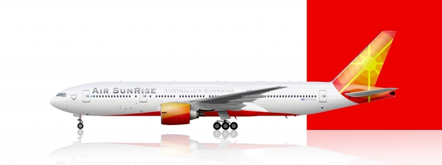
Air SunRise 772
- Owner: Liam_219 (View all images and albums)
- Uploaded: Oct 05 2022 09:12 AM
- Views: 911
- Album Virtual Airlines

Air SunRise 777-200/ER. First delivered in the late 90s, the 772ER was grounded due to COVID, and only recently have the 8 units delivered from 2006 finally returned to the skies
Still not good
Still not good
Ethan have you seen your own posts?
Ethan have you seen your own posts?
ok i'll pay that
I'm not 100% sold on the font, is there a gradient on it or is that the template?
Other then the engine paint, which looks odd - maybe try a solid colour?, this is rather enjoyable
Also if you're gonna have a lot of things by Door 1L, some carriers blank windows, it makes it look less busy there
Lots of improvement. Agree on the font and engine being solid - although the engine gradient here is nicer.
Also the detailing seems weird. The heart is a bit big and I'm not sure what it's for.
Lots of improvement. Agree on the font and engine being solid - although the engine gradient here is nicer.
Also the detailing seems weird. The heart is a bit big and I'm not sure what it's for.
I added the heart to the livery in a time when I was surrounded by a lot of negativity. I thought it would be a cute idea and a little way of being somewhat positive, y'know? just a little <3
Ethan have you seen your own posts?
I don't quite think that my own posts have any relevance to the fact that were trying to give you good recommendations on how to make your livery stand out a little bit more.
As stated, the gradient font just doesn't work.
I don't quite think that my own posts have any relevance to the fact that were trying to give you good recommendations on how to make your livery stand out a little bit more.
As stated, the gradient font just doesn't work.
Dunno what parallel universe you're living in where just saying "still not good" is giving "good recommendations".
Anyway, I agree that this looks pretty good and you are improving. I agree that the heart is a tad bit large, and I think it might also look better if it was moved up just a little bit, maybe so that the centre is in line with the centre of the cockpit windows.
In addition, I think the font might look a bit better if it was all caps, and I'm not sure about having the slogan (I know that Qantas does it, but not many other airlines do).
Also, I feel like the sun design on the tail could be "stylised" just a bit, maybe have the rays starting thick at the sun and then thinning down as they get further away. Also also, same feedback about the smaller details as on the 757.
Keep it up, you're doing great!
I don't quite think that my own posts have any relevance to the fact that were trying to give you good recommendations on how to make your livery stand out a little bit more.
As stated, the gradient font just doesn't work.
idk how you expected me to get any of that out of "still not good"

 Sign In
 Create Account


I'm not 100% sold on the font, is there a gradient on it or is that the template?
Other then the engine paint, which looks odd - maybe try a solid colour?, this is rather enjoyable
Also if you're gonna have a lot of things by Door 1L, some carriers blank windows, it makes it look less busy there