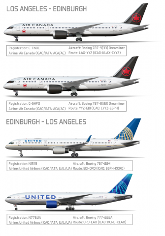
Los Angeles to Edinburgh Aircraft Poster
- Owner: E.B Aviation (View all images and albums)
- Uploaded: Jul 05 2022 06:20 PM
- Views: 760
- Album Real World Liveries

In the past 2 weeks I was on a trip around the United Kingdom. I took two airline carriers: Air Canada and United, and I tried their Transatlantic and Transcontinental products. If I were to say who was the better carrier in this case. I would say United Airlines. United has an overall better Transatlantic/Transcontinental Economy product. They have more comfortable seats, better food, greater selection of movies/shows on the IFE, free messaging service and so on and so forth. Unfortunately during my leg from ORD-LAX the Wi-Fi wasn't working meaning I cannot connect my phone to the entertainment website or have free messaging. However I was otherwise prepared for events like those happening with other options. If it weren't for the fact that the Wi-Fi system was down. The flight for me would've been perfect.
Air Canada was the lower ranking airline in my opinion, because of these reasons: Lack of drinks/snacks (even water), Lower food quality (They served bland and overcooked pasta), Seats aren't as comfortably padded (Literally I was more comfortable on a 757 with an older cabin), and glitchy IFE's on 787-8.
So if you were to look for an airline to go Transatlantic. I wouldn't recommend Air Canada as much as I would with United. So don't fall for the fact that Air Canada is advertised as "North America's Best Airline" because it really is not. Definitely can be improvements with the service.
The two united are not quite right. The blue and gold on the 57 are too light. The position of the globe on the 57 is also wrong. the globe should end just before the tail's trailing edge, not go past it. United also does not utilize the kind of SATCOM you have shown in the post. The colors for the 777 are also slightly off, I would recommend using the official color palate on the United website. The globe for the 777 is also incorrect. It should be much more filled in on the bottom front corner. The strip is also wrong. It has a much more gradual slope to the nose that takes it past the gear door. The tail also has too much of the halftone blue. You're also missing the additional stipe of the darkest blue behind the globe between the globe and the white. The "connecting people, uniting the world" text is also too large. The main United text is also too small and is placed too far back.
I use a few tricks to get it right, counting windows, looking where things intersect doors, and at least 30 minutes of research.
Thank you... for all of this feedback. This will be a lot for me to process in but I'll be making these changes.
After I heard what happened on United years ago I am never flying with them even if Air Canada is terrible
After I heard what happened on United years ago I am never flying with them even if Air Canada is terrible
What? You mean the Denver engine failure?

 Sign In
 Create Account


The two united are not quite right. The blue and gold on the 57 are too light. The position of the globe on the 57 is also wrong. the globe should end just before the tail's trailing edge, not go past it. United also does not utilize the kind of SATCOM you have shown in the post. The colors for the 777 are also slightly off, I would recommend using the official color palate on the United website. The globe for the 777 is also incorrect. It should be much more filled in on the bottom front corner. The strip is also wrong. It has a much more gradual slope to the nose that takes it past the gear door. The tail also has too much of the halftone blue. You're also missing the additional stipe of the darkest blue behind the globe between the globe and the white. The "connecting people, uniting the world" text is also too large. The main United text is also too small and is placed too far back.
I use a few tricks to get it right, counting windows, looking where things intersect doors, and at least 30 minutes of research.