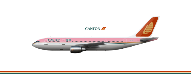
(1971) Airbus A300B4
Uploaded by hayhaa, Oct 11 2021 04:03 AM
- Owner: hayhaa (View all images and albums)
- Uploaded: Oct 11 2021 04:03 AM
- Views: 1,081
- Album Canton Airways
Copyright
me, ab

Hopefully this is the last livery iteration.
Once again, this is quite a nice livery, and I do like the colours used. However, the red text on the pink background is quite hard to read, so that's something I'd consider changing.
thx + fixed
me likey
Kinda liked it better with the red text and white outline over the pink background. I think it’ll also sound smart if it was just “Canton.”
Kinda liked it better with the red text and white outline over the pink background. I think it’ll also sound smart if it was just “Canton.”
Nah the text is really hard to see from afar when it's red, but I agree with the second point, though.
Very lovely ![]()
This Deserves More Comments!!!!!
This Deserves More Comments!!!!!
u deserve kisses (from me)
Very lovely
thx
This is logo design teaching tape

 Sign In
 Create Account


Once again, this is quite a nice livery, and I do like the colours used. However, the red text on the pink background is quite hard to read, so that's something I'd consider changing.