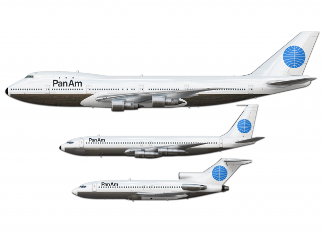
Pan Am Rebrand 1970 - Livery Concept
- Owner: crossfire (View all images and albums)
- Uploaded: Aug 07 2021 01:37 AM
- Views: 1,861
- Album _colorbars_

This is my third post about Pan Am and I'm starting to think that's too many.
I was scurrying the internet on random topics as usual when I came across the website of the design firm that made the Pan Am rebrand that was attempted from 1970-1973. They had a livery concept for it so I decided to put it on the Pan Am planes.
Aaaannnndd it looks mediocre. Thank god they kept the old version.
You made Pan Am look like a 9 year old designed it...how could you do this?
You made Pan Am look like a 9 year old designed it...how could you do this?
I didn't design it. These guys did: https://www.cghnyc.c...k/project/panam
Well you also have three posts about Southwest and three posts about United, so...
guess I just have posted too much on this album in general then
I didn't design it. These guys did: https://www.cghnyc.c...k/project/panam
SCARY
I didn't design it. These guys did: https://www.cghnyc.c...k/project/panam
ok but like you still didnt do it right.
- The Grey/Silver belly extends all the way to the nose cone.
- The PanAm titles on the 747 are too large
- You missed the black nose on the 727 all together

 Sign In
 Create Account


Well you also have three posts about Southwest and three posts about United, so...