
 Sign In
 Create Account

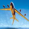
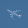
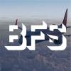
Avion | Boeing 767-300 | 2000s | "Première"
- Owner: Zac23 (View all images and albums)
- Uploaded: Jun 16 2021 01:19 AM
- Views: 660
- Album Retired Brands
© Zac23 [You may NOT use, alter, sell, or distribute my work without EXPLICIT permission granted by Zac23 in writing] [Template: Airplano]

Jumped a few years, in love with this livery ngl. This livery will stick from 2000ish to 2015ish haven't decided yet.
Anyone a fan of the new background? @Airplano these template improvements are fantastic btw.


Whats the tail supposed to be?
It appears to be a stylized letter "A"


Amazing except the tail
I still find this brand to be boring an uninspired. The colors are also ridiculous. It looks like every plane was left out at Victorville for 6 years and THEN put into service. There is no way I could look into the sky and identify what airline that would be it would just blend in.
I still find this brand to be boring an uninspired. The colors are also ridiculous. It looks like every plane was left out at Victorville for 6 years and THEN put into service. There is no way I could look into the sky and identify what airline that would be it would just blend in.
Amazing except the tail
Whats the tail supposed to be?
Thanks for the feedback! I'm going to probably scrap this design and go back to the drawing board.
I still find this brand to be boring an uninspired. The colors are also ridiculous. It looks like every plane was left out at Victorville for 6 years and THEN put into service. There is no way I could look into the sky and identify what airline that would be it would just blend in.
I agree with this but I would also take the whole #1 luxury airline in France off it makes it look like easy jet or Ryanair. and if this is a one off it still makes little sense I feel like the color of text would make it illegible from a terminal or maybe even from other aircraft it the sun hits it right. I would either make the text black or choose a darker blue. Other than that it is a great start.
I agree with this but I would also take the whole #1 luxury airline in France off it makes it look like easy jet or Ryanair. and if this is a one off it still makes little sense I feel like the color of text would make it illegible from a terminal or maybe even from other aircraft it the sun hits it right. I would either make the text black or choose a darker blue. Other than that it is a great start.
Thanks for the feedback! The text is a one-off, but I’ll be taking the color recommendations into consideration. I’m reworking the livery with the help of a few friends so a revised version will be out soon.

I'm going to probably scrap this design and go back to the drawing board.
I actually unironically like this brand a lot. Maybe you could freshen up the design, keep it interesting?

