
 Sign In
 Create Account


- Owner: TommyDH (View all images and albums)
- Uploaded: Mar 08 2021 01:24 PM
- Views: 1,514
- Album Showcase

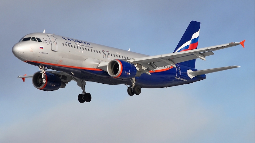
Airline: Aeroflot
Country: Russia
A/C Type: A350-900
A/C Reg: VQ-BFY
Livery: 2003 onwards
Aeroflot changed their livery in January 2020 when they received the A350. Since then, all A350 have the new livery but the A320neo's and A321neo's have been painted and delivered in the silver livery.
Giving me Aeroflot's 1992 livery on the A310s vibes. Testing a new livery, then retire it in favour of the older one... I think the silver livery looks better than the white one.


Nice, though I do think the A350s look better in the new livery. Which overall I like better...it's much more appropriate for our time than the 2003 one, and (in my opinion) a very well executed modernization.
And I agree, it's super weird that Airbus keeps building A350s for Aeroflot and painting them into the new livery, while A320neos and A321neos are being painted into the old livery. SU hasn't taken delivery of any of these aircraft yet though (except VQ-BFY, the very first A350) so I guess it remains to be seen whether maybe the A320/21neos will eventually be repainted?
Or perhaps the A320/21neo aircraft that have already been built were already in the process of being painted into the old livery before the new one was introduced (some parts, at least the tail, are painted long before the aircraft is actually assembled) so they decided to just put the old livery on them? And eventually newer-build aircraft will be painted into the new one?
EDIT: Oh and I forgot to say - this is quite nicely done, you seem to have all the details correct. Except I do think the blue should be a bit darker...the general blue color is meant to be darker than the blue part of the flag on the tail, not the same shade as it.
You're right, the blue should be darker... I was following the brand guidelines they published but even there it says the orange should be a very bright orange. So I guess they don't even follow those guidelines themselves! 
When in production the tails are painted long before the fuselage so they can calibrate they systems. So most likely you're right and they painted the tails a while ago and didn't want to bother repainting and recalibrating. Thank you for breaking my dreams 
I would like the new livery if the titles and SkyTeam logo were not to damn big. You can hardly see the winged hammer and sickle! At least the cabin is very nice and I can't wait for them to retrofit their long haul aircraft with the new seats.

I do think I like the silver more. White is so overdone and the silver was more in keeping with Skyteam's color scheme. Good job!
When in production the tails are painted long before the fuselage so they can calibrate they systems. So most likely you're right and they painted the tails a while ago and didn't want to bother repainting and recalibrating. Thank you for breaking my dreams
I guess that's the explanation then, but wow it must be really hard to repaint the tails if they decided that it's not worth the trouble and put the entire aircraft in the old livery instead
Also, the blue is much more accurate I think, now that you've changed it. Regarding the orange: it varies (a lot!) plane by plane. Some have really bright orange lines on the fuselage + engine and winglets, while on others the orange is a lot more subdued, and only slightly different from the red color on the flag. Just compare the photos of an A320 and a newly-built A321neo below. By the way the same goes for the gray - that's super inconsistent too. On some planes it's nearly white, on others it's much darker, and the degree of 'shinyness' also changes. Looking out across the ramp at SVO, especially on a clear day when the sunlight highlights all the differences, you can really see how much the livery varies plane to plane.
But yeah basically you should probably use the same orange you have on the winglet here for both the fuselage line and the front of the engine, and make the the red part of the tail transition to orange via a subtle gradient just above the L4 door (so right at the rear, if that makes sense).

Sorry for the double comment but I just realized - do you already have a gradient on the red fuselage line? It looks more orange at the front than at the back...if you do, I think the gradient should be localized to the very rear, as I explained above. Cause the entire line except for the very end of it right below the tail is meant to be orange. Again though, apart from my nitpicking about precise colors, you've done a pretty damn good job with this
Sorry for the double comment but I just realized - do you already have a gradient on the red fuselage line? It looks more orange at the front than at the back...if you do, I think the gradient should be localized to the very rear, as I explained above. Cause the entire line except for the very end of it right below the tail is meant to be orange. Again though, apart from my nitpicking about precise colors, you've done a pretty damn good job with this
Still don't think I got it 100% correct but here's another try. More orange and gradient just above L4.
Still don't think I got it 100% correct but here's another try. More orange and gradient just above L4.
Excellent, that's exactly what I had in mind! Looks fantastic now.
Also, here's something that's kinda odd... for years and years, Aeroflot used this image right here on its website, app, advertising material, etc. It was everywhere you looked, even plastered on every wall in Sheremetyevo. I've always assumed it's meant to be an A350, but some sort of really odd rendering of one, from back before the design was even finalized? In any case, they kept using it even when they re-did their website completely two-ish years ago, but as soon as the first A350 was delivered they made this image disappear...literally wiped it out of existence, it's nowhere to be seen now. I guess cause it would've been super weird to still be using it when the actual plane it's (meant to be) depicting already exists and looks nothing like this 

Anyway...sorry for the odd tangent, just thought this was kinda relevant in some weird way

Excellent, that's exactly what I had in mind! Looks fantastic now.
Also, here's something that's kinda odd... for years and years, Aeroflot used this image right here on its website, app, advertising material, etc. It was everywhere you looked, even plastered on every wall in Sheremetyevo. I've always assumed it's meant to be an A350, but some sort of really odd rendering of one, from back before the design was even finalized? In any case, they kept using it even when they re-did their website completely two-ish years ago, but as soon as the first A350 was delivered they made this image disappear...literally wiped it out of existence, it's nowhere to be seen now. I guess cause it would've been super weird to still be using it when the actual plane it's (meant to be) depicting already exists and looks nothing like this
Anyway...sorry for the odd tangent, just thought this was kinda relevant in some weird way
Yup, that was the first clean-sheet design for the A350. This design was unveiled in 2008, I believe...


Nice, though I do think the A350s look better in the new livery. Which overall I like better...it's much more appropriate for our time than the 2003 one, and (in my opinion) a very well executed modernization.
And I agree, it's super weird that Airbus keeps building A350s for Aeroflot and painting them into the new livery, while A320neos and A321neos are being painted into the old livery. SU hasn't taken delivery of any of these aircraft yet though (except VQ-BFY, the very first A350) so I guess it remains to be seen whether maybe the A320/21neos will eventually be repainted?
Or perhaps the A320/21neo aircraft that have already been built were already in the process of being painted into the old livery before the new one was introduced (some parts, at least the tail, are painted long before the aircraft is actually assembled) so they decided to just put the old livery on them? And eventually newer-build aircraft will be painted into the new one?
EDIT: Oh and I forgot to say - this is quite nicely done, you seem to have all the details correct. Except I do think the blue should be a bit darker...the general blue color is meant to be darker than the blue part of the flag on the tail, not the same shade as it.