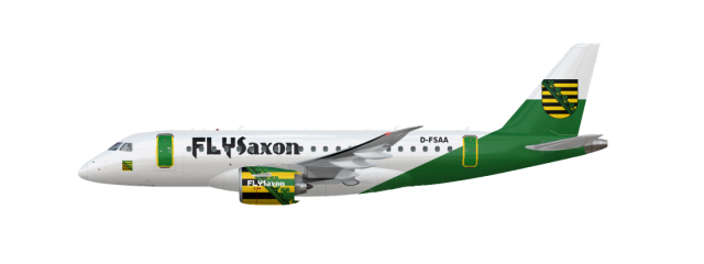
FlySaxony E175-E2
- Owner: Level (View all images and albums)
- Uploaded: Dec 04 2020 05:59 PM
- Views: 1,266
- Album My liveries

I----
What?
Its... not that good, try to start with something more simple! ![]()
Its... not that good, try to start with something more simple!
So what do you want?
This?
It's certiainly...there. I'd recommend less tiny busy sections and more overall design flow and detail.
It's certiainly...there. I'd recommend less tiny busy sections and more overall design flow and detail.
Thats what I mean ^^
that is a lot to take in
I am so upset that the L2 door breaks up the line in the aft of the fuselage. The stripes on the engine make anything hard to see and with text not aligned to them it is absolutely repulsive. There is no effort put into logo design. All in all I despise this.
Im not changing it

 Sign In
 Create Account


oh jesus