
 Sign In
 Create Account


- Owner: FlyHighAviator (View all images and albums)
- Uploaded: Nov 19 2020 08:53 PM
- Views: 1,784
- Album Air Portugal
©Runway25Design

After having a big look at my old Air Portugal brand, I decided to scrap it alltogether so LAP - Portugal Airlines can take it's place. I just kept the logo, red and dark red from the "tomato" L1011 and boom, here we are! Thank you to all who helped me make this on point! I will shortly delete all the old AP stuff from the gallery, so if you still want to take a good look at it, feel free to do so. It will always have a special place in my heart since it got me into DWA, but its time for improvement.


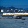
It's nice. I would only move the 'portugal airlines' titles to the right, so it's next to door L2 instead of on it.
It's nice. I would only move the 'portugal airlines' titles to the right, so it's next to door L2 instead of on it.

real nice

I feel like the way the red thing curves up at the nose is a little weird. Apart from that, I love this livery. The subtle fading of the pattern on the tail is beautiful... It's a pity to see AP go, but this is great!
Wow love it 
At the same time ill miss air Portugal tho

Very nice...will kinda miss Air Portugal tho. Will Explorer be going too, or will it stay? 


Though, this is nice, I'd adjust the swoop a bit. It looks a bit...strange.

Damn nice!


Beautiful evolution