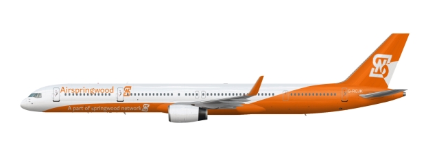
Airpringwoods new 757
Uploaded by itznordic, Sep 25 2020 12:36 PM
- Owner: itznordic (View all images and albums)
- Uploaded: Sep 25 2020 12:36 PM
- Views: 402
- Album My different liveries i have made

The logo still makes no sense, its placement on the fuselage is bad, the colour shape on the back of the fuselage is really bad, the text on the fuselage is also really bad, and the "A part of Springwood Network" text placement is horrible. Honestly, that is one of the worst places to put ANYTHING on a plane, especially text...
Id like to add that the tail logo is rotated for no apparent reason and is interrupted by the tail design, font still sucks, and while at least I know what the logo stands for, it still doesnt work for an airline, and “Springwood Network” sounds like a local TV broadcasting company - not a transportation company.
However, credit where credit is due. You did listen to some of the previous feedback by adding a detail explaining the SN logo. Massive props to you for that - most people just get offended and delete their old post, then go and make the same mistakes all over again. Keep it up

 Sign In
 Create Account


The logo still makes no sense, its placement on the fuselage is bad, the colour shape on the back of the fuselage is really bad, the text placement on the fuselage is also really bad, and the "A part of Springwood Network" text placement is horrible. Honestly, that is one of the worst places to put ANYTHING on a plane, especially text...