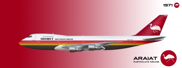
Boeing 747-200B ARAIAT
- Owner: Rigel (View all images and albums)
- Uploaded: Sep 05 2020 09:53 AM
- Taken: 2020:09:05 19:53:24
- Views: 1,676
- Album ZYX - Brands By Rigel
Template by Med. Logo and livery by Rigel

By the 1960s, ARAIAT was growing rapidly. The introduction of the jet engine had allowed the airline to reduce their prices, allowing for more people to travel to and from Australia. With this massive spike in passenger demand, more 707s and VC10s were being ordered and delivered at faster and faster rates. This was turning out to be a huge problem. Melbourne, Sydney and Perth, ARAIAT's main hubs, simply could not handle this many passengers, and were constantly being filled to capacity. Many flights were being rerouted, because the airports were at full capacity. It wasn't uncommon for people to spend more time sitting on the taxiway, waiting to takeoff or pull into the gate, than in the actual flight. An increase in the risks and numbers of flight accidents at this time was also occurring. ARAIAT was quickly becoming overloaded by the passenger numbers.
That is, until the Boeing 747 came along. With a passenger capacity of around 400 people, and a range of 12,700 km, the Boeing 747-200B seemed to reverse all of the problems ARAIAT was facing at the time. With the newest engines, high-bypass turbofans, a new kind of engine, these aircraft were incredibly efficient and quiet. Incredibly excited by the new aircraft, ARAIAT ordered 16 of the aircraft, to be delivered between 1971 and 1977. By waiting until 1971 to receive their first, ARAIAT could get the newest 747-200B, which didn't have the range limitations of the original 747-100.
The Boeing 747 really was a godsend for ARAIAT. Not only was the new aircraft vastly more efficient on long-haul routes than the 707 and VC10, but just one of these aircraft could replace four of the smaller jets, saving even more money on fuel. This helped to drive down costs even further. Finally, Australians had a really cheap, efficient, and fast way to get to the United States and Europe. ARAIAT's 747s were frequent visitors to places like Los Angeles, San Francisco, New York, London and Paris, among others. In addition to the 747s, ARAIAT also placed and order for the McDonnell Douglas DC-10 to operate on lower-demand Asian routes.
ARAIAT also used the 747 to introduce the next iteration in its brand identity. The colours of orange and medium-dark red remained, and were joined by a bright red and yellow. This livery is the first time these four colours were together, and the colour combination has been used for every livery since. The new livery also introduced the next version of the "Soaring Emu" logo, which had folded its legs as if it was flying through the air, carried up by a pair of bright red wings. This livery lasted until 1983.
Shown above is VH-EBN, one of the airline's many 747-200Bs, in the 1971-1983 livery. The 747-200s operated reliably and efficiently throughout their service life, finally being retired in 1995 after 24 successful years in operation, to be replaced by none other than the next generation, the 747-400. In fact, ARAIAT was so happy with the 747 that they have operated every single major variant of the 747 apart from the -100; The 747-200, 747SP, 747-300, 747-400 and 747-8i. In addition, the 747-200F, the 747-400F and the 747-8F have been/are being operated by ARAIAT's cargo division, ARAIAT World Freight.
Finally bringing ARAIAT back! Expect to see a lot more of this brand soon, I have a lot of missed content to catch up on!
Also, leave feedback! Any and all feedback helps (but preferably constructive).
The logo looks a little janky with the wings, but I do love the emu being the symbol
Thank you! It was inspired by Qantas' 1970s livery and logo (and you can easily see that), and I chose the emu specifically to be different from literally every major Australian carrier in real life and on AE...
Thank you! It was inspired by Qantas' 1970s livery and logo (and you can easily see that), and I chose the emu specifically to be different from literally every major Australian carrier in real life and on AE...
For sure!
The irony of a bird that can’t fly for an airline though haha.
For sure! The irony of a bird that can’t fly for an airline though haha.
Well, it's perfect for 2020 then... ![]()
![]()
But I though the emu worked because 1) It's on the Australian Coat of Arms, so quite significant, 2) It's the national bird of Australia (I originally wanted to use a kookaburra, but I decided the emu represented Australia more), and 3) As said many times before, I wanted to do something different from the kangaroo.
I'm glad this airline has been so well-received, though. It's the airline from my home country, and I consider it my "flagship airline".
I really need to start posting more of this brand, especially to make it more established by the airline's 100th anniversary in October...
Please never do anything related to Australia again or so help me scomo i'll shirtfront you into next week.
The font is again, hard to read. The logo looks like two cliparts shodily merged together (like what's the point of putting wings on a bird that already has wings?)
The name isn't that great either tbh.
3/10 not essential
I think I have a right to make an Australian airline, as I am, in fact, from Australia. You can't police me on what liveries I post and don't post.
I accept that maybe my comments are a little bit over-the-top, and that you find that a bit annoying. And for that, I apologise. But I would ask that you don't go around rating all of my liveries one star because of it.
I might get rid of the wings on the logo, but I thought that since the wings on the emu don't actually serve any purpose related to flight, I thought it worked. Additionally, these could actually be the emu's wings, just that they are a different colour than the emu's body for better contrast.
Font may get a change as well. Although I don't seem to have gotten any other comments regarding it, I might change it.
FYI, name stands for "Australian Regional And International Aerial Transport", and it is pronounced ay-ray-at. Again, no one else seems to have a problem with it, so I don't think I'm going to change it.
One more thing, while they might look a bit like cliparts, this logo, along with all of the logos in all of my liveries, is hand-drawn.
Thank you for the feedback nonetheless.
FYI, name stands for "Australian Regional And International Aerial Transport", and it is pronounced ay-ray-at. Again, no one else seems to have a problem with it, so I don't think I'm going to change it.
Araiat sounds like ayran thats kinda racist dude.
also i aint rating your liveries dude xx calm down
no one else seems to have a problem with it, so I don't think I'm going to change it.
i have to say, it doesnt roll off the tounge easy, so changing it may be a good idea.
I agree with zachi have to say, it doesnt roll off the tounge easy, so changing it may be a good idea.
I agree with zach
Okay, I'll change it.

 Sign In
 Create Account


