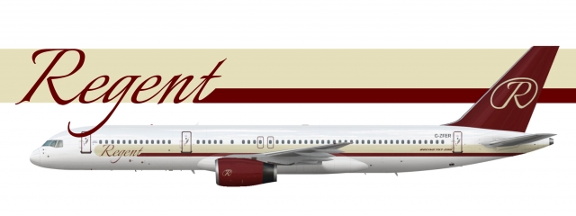
Regent Int'l Airways 752 - 1990s
- Owner: ThePessimist (View all images and albums)
- Uploaded: Aug 20 2020 04:58 PM
- Views: 645
- Album Regent International Airways

The 90s were not a prosperous time for Regent and as profits slumped in 1995, executives chose to modernize the livery with this "slick yet classical" new look. Regent did not want to spend the cash to repaint existing aircraft but after a 1997 buyout of another cash strapped British firm, new planes acquired were painted in this livery.
(I know this one is also simple and a bit of an ugly duckling but I wanted it to look more 90s but keep some of the 'design language' from the 80s livery)
[Edit: Changed background and made the R thicker]
Only criticism is the R could be of a higher quality on the tail. Looks very nice though.
Thank you, is the R problem fixed with the thicker circle outline?
Ooh, I like this!
Good job. This definitely has the "damn I don't wanna fly with this airline but the tickets are 30 dollars" vibe.
One note, the background "Regent" text is layered wrong and it's now above the aircraft.
Ooh, I like this!
Thanks
Good job. This definitely has the "damn I don't wanna fly with this airline but the tickets are 30 dollars" vibe.
One note, the background "Regent" text is layered wrong and it's now above the aircraft.
That's what I was going for. I actually meant for the G to be above the airframe, I thought it gave the logo a bit more pop and it was a cheesy thing.

 Sign In
 Create Account


Only criticism is the R could be of a higher quality on the tail. Looks very nice though. You would have to reupload the other livery into this album.