
 Sign In
 Create Account

Rebranding | 2007
- Owner: POTKC (View all images and albums)
- Uploaded: Jun 25 2020 02:41 PM
- Views: 1,876
- Album Global Group
Templates by Medviation, liveries and seatmap © POTKC 2020, reproduction or use not permitted without written and explicit consent.

(TOP)
Airline - Global Airlines
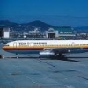
Aircraft - Boeing 757-200 | N465GA
Delivered to Global Airlines, 1996
Stored at Victorville, 2016
Sold to West Cargo, 2016
Converted to 757-200F, 2016
Livery - Standard 2007
Country - United States of America
(TOP)
Airline - Global Airlines
Aircraft - Boeing 767-200ER | N5309G
Delivered to Global Airlines, 1992
Stored at Pinal Airpark, 2010
Scrapped at Pinal Airpark, 2013
Livery - Standard 2007
Country - United States of America
In 2007, Global Airlines introduced a new brand identity, with a significantly modified (and slightly more abstracted) logo. The new livery is shown on N465GA and N5309G, a 757-200 and 767-200ER, respective. N465GA was one of the later 757s delivered to Global Airlines, with a higher MTOW certification which in the early 2000s Global Airlines used to have it certified for ETOPS flights. This allowed the higher-MTOW 757s like the one shown here to operate lower-demand transatlantic flights, such as from New York to Glasgow or Porto. N5309G was a standard 767 which joined the fleet in the early 90s, initially flying important routes to Europe. After the post-9/11 travel demand slump it was relegated to shorter South American services, and was one of the thirty-five 767-200ERs converted into domestic aircraft in 2007.
As part of the 2007 rebranding new interior hard products were introduced, which on the ETOPS-certified 757s meant fully-flat Global Business and new Economy Class seats with in-seat IFE. Domestic 767-200s weren't so lucky, however - while their cabin configurations were heavily modified from the ones they were delivered in 15-20 years prior (see the new seatmap above), the Economy Class seats were simple reupholstered without gaining in-seat IFE like most other aircraft in the fleet. In Domestic First (which was occasionally referred to as Global Business when these aircraft flew to the Caribbean, Mexico, or Canada, but that was quite rare) the domestic 767s were fitted with 36 seats in a 2-2-2 configuration. These seats were simple recliners, though with in-seat IFE, unlike Economy. As seen on the image above, the domestic 767-200ERs did mostly retain their ETOPS certification (with some eventually losing it due to engine swaps in maintenance), however it was rarely used, and in fact N5309G - the 767 shown here - did not fly a single transatlantic trip between 2007 and its retirement in late 2010.


Blyatiful
Interesting

Ooh you spiced it up a bit. The colors look dull, but the design itself is nice. 
Ooh you spiced it up a bit. The colors look dull, but the design itself is nice.
Thanks! Any suggestions for how the colors could be improved here? I had a different version of this that was based a bit more heavily on the Global Premier branding, except with different shades of purple instead of just one. It ended up looking way too pink though so I scrapped that...
Thanks! Any suggestions for how the colors could be improved here? I had a different version of this that was based a bit more heavily on the Global Premier branding, except with different shades of purple instead of just one. It ended up looking way too pink though so I scrapped that...
You should make the shades of maroon more recognizable.

Actually pretty decent, but the font just doesn't work for an airline...
You should make the shades of maroon more recognizable.
What do you mean? Like make the two shades more different?
I feel like that would make the lighter 'intermediate' swoops at the front and back of the fuselage too bright and they'd stand out too much...I can try it and see it how it looks though
Actually pretty decent, but the font just doesn't work for an airline...
Why not? Is it too thin maybe?
Why not? Is it too thin maybe?
That's part of it. It also looks unoriginal. SO many airlines on AE use fonts that look super similar. Adjusting the kerning, going all caps, and eliminating the "airlines" bit at the end, using a bolder font, etc. would all help this work... if that makes sense

That's part of it. It also looks unoriginal. SO many airlines on AE use fonts that look super similar. Adjusting the kerning, going all caps, and eliminating the "airlines" bit at the end, using a bolder font, etc. would all help this work... if that makes sense
I see what you mean, but the reason I stayed away from doing basically all of the font on the 1994 livery. It was bolder, had wider kerning, all caps, and only said 'GLOBAL'. Maybe staying with just one word for the titles until the next rebranding would work though. I'll try it.
If you didn’t use Default fonts, your stuff would be 10x better.
I don't, 90% of my liveries use fonts I specifically find and install for that project.


Blyatiful