
 Sign In
 Create Account


- Owner: ThePessimist (View all images and albums)
- Uploaded: Jun 11 2020 01:31 AM
- Views: 1,581
- Album The Pessimist One Offs

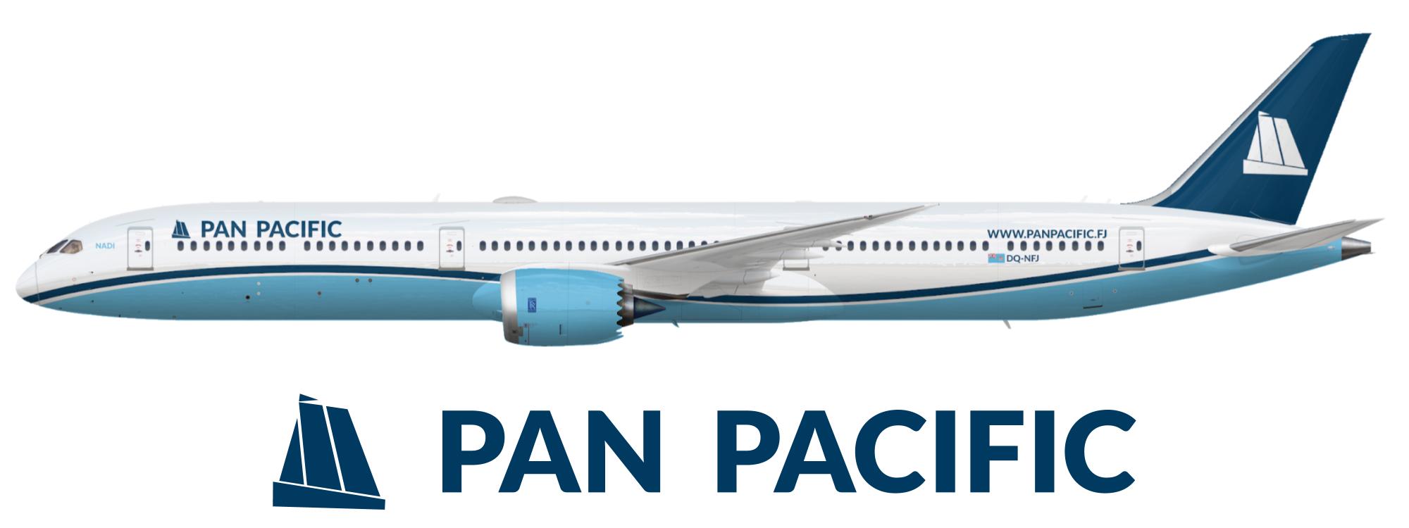
Here's the first draft of my entry into the Oceania design competition for Fiji's flag carrier Pan Pacific Airways. I know others on the gallery have had Pan Pacific airlines but it's been a few years so hopefully that's alright. I actually quite like this one and its geometric ship logo, even though it's really quite conservative and simple. I'm sure there's stuff that could improve though, so please tell me what that is.


Better than what some of the others have put out for sure, but needs work still.
I get you're going for a United look but you could've done a little bit better of a job with elements. Namely the stripe, it feels like there's too much of a gap between it and the belly paint. Also I'd consider moving the whole thing down the fuselage more.
I liked having more of the light blue on the fuselage then United had with the grey, do you think it looks better with the dark blue stripe a lot closer to the light blue?
logo doesnt fit with the livery
logo doesnt fit with the livery


Wow, the gallery actually giving tips... 
All jokes aside, this is a good start, but as some people have said above, the logo doesnt work that well with the "flowy" fuselage paint. The font could use some improvement and as Adam said, the United look needs to be executed a bit better here.
logo doesnt fit with the livery
Yeah the tail design doesn’t work with the swoops on the fuselage...
Wow, the gallery actually giving tips...
All jokes aside, this is a good start, but as some people have said above, the logo doesnt work that well with the "flowy" fuselage paint. The font could use some improvement and as Adam said, the United look needs to be executed a bit better here.
I do like the tall ship logo but I agree that it probably doesn't quite fit with the flow. I'm working on making a different logo and maybe changing the name to something more Fijian and less generic for round two of this livery, thanks all!


Better than what some of the others have put out for sure, but needs work still.
I get you're going for a United look but you could've done a little bit better of a job with elements. Namely the stripe, it feels like there's too much of a gap between it and the belly paint. Also I'd consider moving the whole thing down the fuselage more.