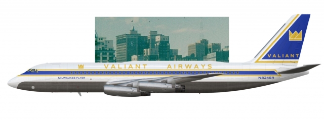
Valiant Airways Livery 1960-1962
- Owner: ThePessimist (View all images and albums)
- Uploaded: May 27 2020 05:25 AM
- Views: 838
- Album Valiant Airways [Old]

Valiant's first jet aircraft, the Convair 880M, was introduced to the public in this livery in early 1960. This aircraft, the Milwaukee Flyer, was the first production 880M to enter service with any airline and after a brief tour of the country to showcase the aircraft's blistering speed, this airframe was used on DTW-IDL "Express" flights. Like several other mainline American carriers at the time, the introduction of jet aircraft posed a design challenge for Valiant's livery. Valiant's designers sought a sleek look so they simplified and updated the new crown logo. This livery was fairly short lived though, and by 1962 Valiant moved onto a newer, more complete looking livery with the introduction of DC-8s and transatlantic flight.
This design was hard for me. For one, I think the 880M is just a slightly weirdly proportioned aircraft but I wanted to use it since it's one of Med's templates that doesn't seem to get much use. I think the design looks a bit scattered but it seems that a lot of these early liveries were a bit awkward (see Delta's original Convair livery) The crown logo is stolen from a defunct school bus company, but I think it looks pretty good so I'll probably keep it. Comentary is appreciated and welcome because I'm not entirely sold on this look but I'm not sure what to change.
The registration font looks a bit off for me, but the rest is brilliant!!
Thank you, I agree that retrospectively the reg looks a bit off
The reg is too long (should be a total of five characters after the N, I recommend removing one of the numbers). Apart from that, the livery is actually a pretty good effort, nothing overly offensive about it ![]()
I'd make the corners on the blue and yellow parts of the tail design sharper, so it ends in a sharp point at the base of the tail, if that makes sense. Also maybe try making the lines on the tail crown bolder...or maybe just using the filled-in version from the fuselage? Just something to make it stand out better on the blue background, you know?
The reg is too long (should be a total of five characters after the N, I recommend removing one of the numbers). Apart from that, the livery is actually a pretty good effort, nothing overly offensive about it
I'd make the corners on the blue and yellow parts of the tail design sharper, so it ends in a sharp point at the base of the tail, if that makes sense. Also maybe try making the lines on the tail crown bolder...or maybe just using the filled-in version from the fuselage? Just something to make it stand out better on the blue background, you know?
Fixed the reg and the font, used the filled in crown and sharpened up the lines. I thought the rounded edges might look nice but they're sort of meh and the sharper lines are way better. Thanks!
Fixed the reg and the font, used the filled in crown and sharpened up the lines. I thought the rounded edges might look nice but they're sort of meh and the sharper lines are way better. Thanks!
Yeah, this is better!

 Sign In
 Create Account


The registration font looks a bit off for me, but the rest is brilliant!!