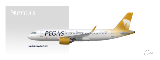
PEGAS | Airbus A320neo
Uploaded by Captain23, Apr 16 2020 10:09 PM
- Owner: Captain23 (View all images and albums)
- Uploaded: Apr 16 2020 10:09 PM
- Views: 515
- Album PEGAS
Copyright
Cap.

In the previous livery, the colors, symbol, and use of gradients were unique and really compelling; I admired that. In that case however, the font seemed to conflict with the rest.
But in this livery, although the font and symbol are well paired by themselves, imo, it feels like you can do more with the livery; like what CJ mentioned, it looks pretty generic.
But in this livery, although the font and symbol are well paired by themselves, imo, it feels like you can do more with the livery; like what CJ mentioned, it looks pretty generic.

 Sign In
 Create Account


The previous livery was better imo. The logo on this one is a bit on the generic side and I feel like there's a bit of a color imbalance with the yellow engine/winglet. The blue was fine as it was, the only problem with the previous one was the backwards facing logo.