
 Sign In
 Create Account


- Owner: AirGEL (View all images and albums)
- Uploaded: Feb 20 2020 12:07 AM
- Views: 2,531
- Album Realism


this triggers me
what triggers you?
the aircraft or the comments?

When you do real world liveries, expect people to be extra critical, as there's no excuse for mistakes, and some of us like the small details to be correct too.
As I said on the other post, keep practicing and you'll learn a lot.

What is this
What is this
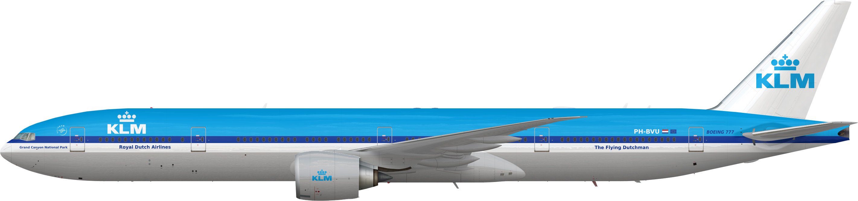
A concept KLM should do
the few things i can pickup - based on an MD-11 livery - the Skyteam logo is both too large and in the wrong spot. Royal Dutch Airlines titles should be aligned with the KLM logo. The Boeing 777 titles at the rear are in the incorrect font
The reason the KLM logo is too far forward on the fuselage is because I wanted to put the KLM 100 years logo next to it, but I couldn't the right logo to put on the aircraft and I just forgot to center it after that.

This should be reworked. Don’t settle for mediocrity, especially with all the good people coming back to critique.
This should be reworked. Don’t settle for mediocrity, especially with all the good people coming back to critique.
I would have to start over if I were to do that

Yes that's the point. You should.I would have to start over if I were to do that


Boeing-style...you can find it online