
 Sign In
 Create Account

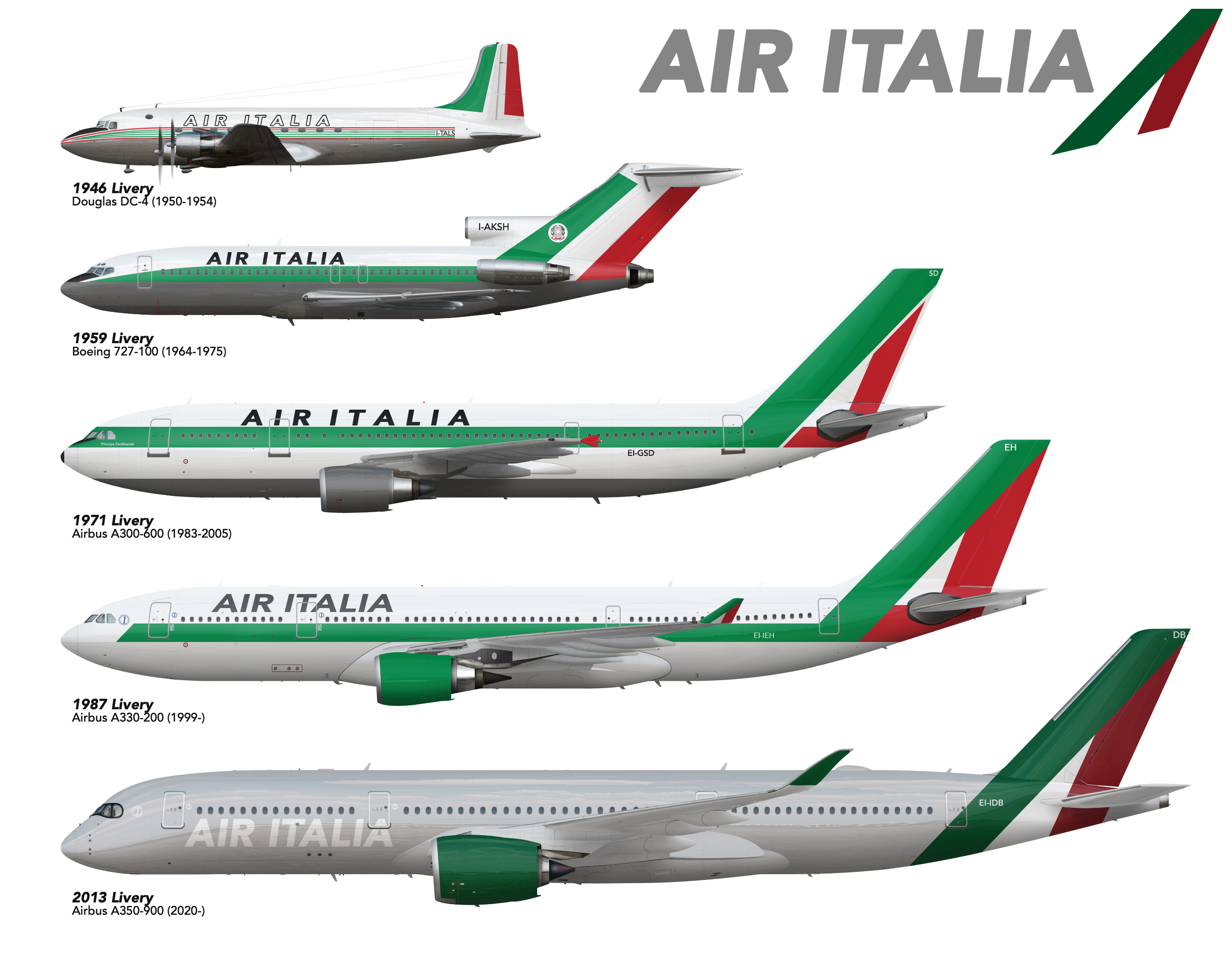
Air Italia | Concept Liveries
- Owner: POTKC (View all images and albums)
- Uploaded: Dec 22 2019 11:49 AM
- Views: 3,277
- Album Global Design
Templates by Medviation, liveries © POTKC 2019, reproduction or use not permitted without written and explicit consent.

Brand evolution of Air Italia, the flag carrier of Italy, 1946-present. Any and all comments and suggestions are welcome, and I will be rolling out a full album with more liveries (as well as seat maps) at a later date.


The modern livery feels too outdated in my opinion

They're all missing something, but I don't know what
i think all of them, except the 1946 livery, are missing something. They seem a little too... plain? I think you need to add a little more spice
I agree, I also feel like something is missing here, which is why I decided I'd post this before properly developing the brand and putting liveries on other aircraft. As I said, if anyone has any ideas on how to improve these/make them more interesting, I'd be very happy to listen.
The modern livery feels too outdated in my opinion
What do you mean by outdated? I actually thought it was a bit too forward for 2013, and might work better as something introduced in the last few years. To be honest with that one I was actually kind of inspired by the new SAS livery, and I like how the gray on the fuselage makes the white part of the 'flag' on the tail really stand out. I actually thought of something that might make it look better while typing this - what do you think about making the gray lighter (but still present to make the white in the flag really pop), and the titles the same shade of green as on the tail design and the engine?

The grey is a nice touch, I agree, but try giving it a glossier finish, as it looks plain as it is. Maybe cheat a bit with a gradient that's lighter in the middle part of the fuselage, and darker on top and bottom. Observe how it looks on photos of aircraft that have this kind of glossy finish.
The font really lacks character and doesn't help with the whole plain look. There are plenty of italic sans serif with more personality.
Regarding the tail, the idea of the tricolore on the tail is good, but it is quite literal. Maybe work around it a bit, add it some depth, maybe some subtle pattern work, I also think that this red is too dark.
Good luck! 

