
 Sign In
 Create Account

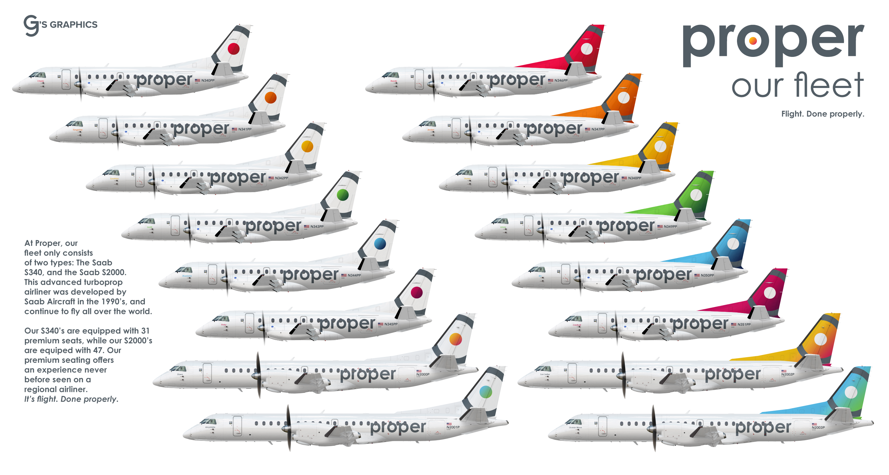
Proper - the whole fleet
- Owner: G.J. (View all images and albums)
- Uploaded: Oct 18 2019 11:01 PM
- Views: 3,142
- Album Mediocre
G.J. - Proper Brand | N664US/BBA/G.J. - Saab 340 template | Med. - Saab 2000 template

proper
Flight. Done properly.™
Proper is a niche-premium carrier based out of Tampa, Florida.
It flies scheduled point-to-point services between major cities on Florida and the Caribbean.
It was founded out of the ashes of SFL Aviation Services, and originally used 4 Beech 1900D's and 1 Saab 340.
The fleet consists of 12 Saab 340B's and 4 Saab 2000's, although these are due to be replaced between
2021 and 2023 with brand-new ATR-42's and ATR-72's.


Ok this is nice
thank you
seems pretty uninspired tbh

leafy
hate the name
livery is eh, alright i guess. Logo be looking like targets logo
seems pretty uninspired tbh
ok
leafy
yes
hate the name
livery is eh, alright i guess. Logo be looking like targets logo
Thanks for the feedback!
Fits the concept pretty well, I like it!

I quite like the concept, just wished the coloured dot (or tail) had a colour gradient, like in the Saab 2000. I think you should stick to one design though, either white tail with coloured dot, or coloured tail with white dot.
The name of the plane I would make it a lot smaller, in bold, and in the colour that you are using for the tail design. I say this because the front of the plane looks relatively bland and empty.
The engine could do with something added to them too, a small version of the circle and dot perhaps.
The name: I like it. It's short, it's simple, and easy to remember.
A few adjustments here and there, and I could see this being a real airline à la Silver Airways.
Fits the concept pretty well, I like it!
Thanks!
I quite like the concept, just wished the coloured dot (or tail) had a colour gradient, like in the Saab 2000. I think you should stick to one design though, either white tail with coloured dot, or coloured tail with white dot.
The name of the plane I would make it a lot smaller, in bold, and in the colour that you are using for the tail design. I say this because the front of the plane looks relatively bland and empty.
The engine could do with something added to them too, a small version of the circle and dot perhaps.
The name: I like it. It's short, it's simple, and easy to remember.
A few adjustments here and there, and I could see this being a real airline à la Silver Airways.
Thank you for all the feedback! The Silver Airways vibe was exactly what I was going for. I’ll go back in and play with your advice, and come back with another update to this. I knew it was missing something and I think you just solved it.

UPDATES:
- Revised tail designs
- Revised naming scheme
- Added Welcome Signs and other small details
Thanks again for the feedback, Tommy!


Ok this is nice