
 Sign In
 Create Account

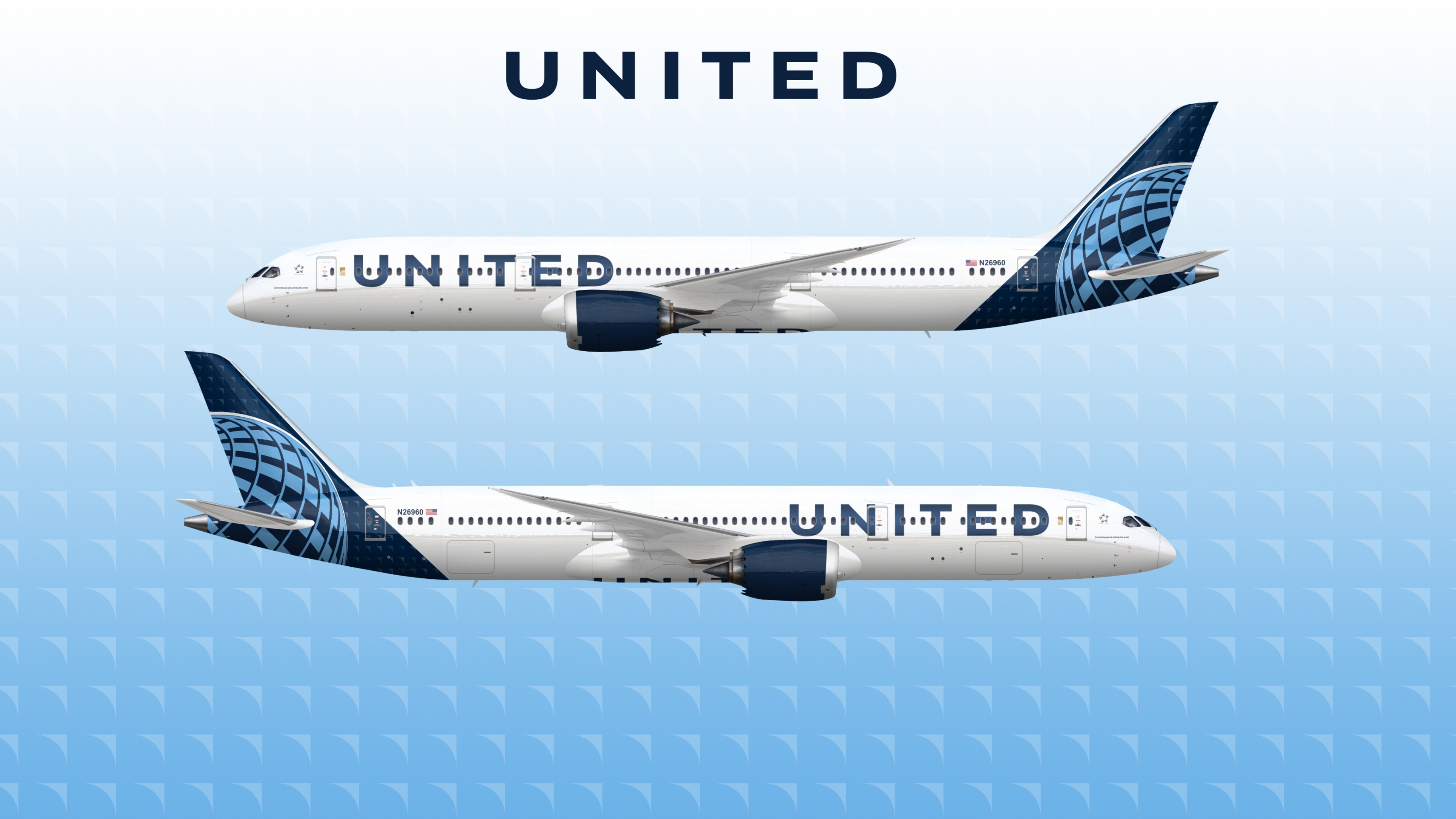
United Airlines concept livery
- Owner: Brentmne (View all images and albums)
- Uploaded: Aug 10 2019 06:17 PM
- Views: 4,425
- Album concepts
concepts

this is what United's livery would look like if it was designed competently
templates by med


Murican Lufthansa...
Murican Lufthansa...
merican... Qantas...Westjet...iberia...aerlingus...Latam...
it doesn't even cut off towards the back so its closer to Aer Lingus rather then Lufthansa
merican... Qantas...Westjet...iberia...aerlingus...Latam...
it doesn't even cut off towards the back so its closer to Aer Lingus rather then Lufthansa
It still is pretty bad... But the fact this could have been true is sad.

My poin of view about this livery; no matter what you do, there will be no results 


It still is pretty bad... But the fact this could have been true is sad.
oh you just wait
you won't be saying that when the 753 and 764 come out with the ugly new livery

yee I like this


damn
I wish that this was the design they chose