
 Sign In
 Create Account

Next Generation Regional Aircraft | 1992-93
- Owner: POTKC (View all images and albums)
- Uploaded: May 03 2019 01:00 PM
- Views: 1,477
- Album Global Group
ATR template by Med, CRJ template by N664US. Liveries © POTKC 2019, reproduction or use not permitted without written and explicit consent.

(TOP)
Airline - New York Airlines dba Global Metrolink
Aircraft - ATR 42-300 | N550NY
Delivered to New York Airlines, 1993
Livery - Standard 1985
Country - United States of America
(BOTTOM)
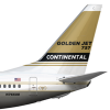
Airline - Maine Airways dba Global Metrolink
Aircraft - Bombardier CRJ-200 | N938MM
Delivered to Maine Airways, 1992
Livery - Standard 1985
Country - United States of America
In the early 1990s, Global Metrolink received two new aircraft types into its fleet, again through regional contract airlines. A new regional partner was also added in 1992 - Maine Airways (inexplicably branded as MaAw), which had previously been a small airline operating out of Portland and Bangor, but expanded into the contracting business at the time. The smallest jet in Metrolink's fleet - the CRJ-200 - was operated at first by both Maine Airways on the east coast and Springair on the west coast (mostly serving Global Airlines' hub in Los Angeles). Configured for 50 passengers, it was perfect for squeezing just over four dozen people into a tiny tube with awkwardly low windows, narrow seats, and loud engines, for flights between half an hour and three hours long. In 1994, when Global Airlines established its base in Miami, a contract was signed with Orange Airlines of Florida to expand Global Metrolink service to the southeast. Orange Airlines already operated over twenty CRJ-200s, which joined the fleet that year.
The second aircraft type to join the Global Metrolink fleet in the early 90s was the ATR 42-300. The first one, N550NY, was delivered in 1993 to New York Airlines. It was a huge upgrade over older turboprops, and with its quieter engines and faster cruise the ATR 42 was beloved by passengers. A total of 38 would be delivered to New York Airlines, however one crashed on landing in Nantucket in 2006. Nobody was killed and all passengers and crew evacuated with only minor injuries, however the aircraft was deemed beyond economic repair, dragged into a field, and abandoned. It became a locally protected historical site - known as the 'Nantucket rust bucket' because of the corrosion it fell victim to - in 2011.


I love it!
Thanks!
dont like the dark gray underbelly. If its that dark make it silver tbh. If it cant be silver make it a light shade of gray

I’m not trying to be rude I’m just giving an honest opinion and constructive criticism, take it as you will, but you need to do something rather than keep uploading the same thing over and over.
Ok... this is going to seem like I am being an ass, but honestly I am not trying to be, I am just being honest with you. The logo for this brand... it’s so unoriginal and really honestly doesn’t look good, if you were going to use a globe you really could have been more creative and you weren’t. The font is generic, and doesn’t look as though much thought has gone into it, and finally that dark grey belly and the simple red cheatline mixed with everything else just makes this brand look unimaginative and really dreary like depressing dreary, overcast day dreary, I wouldn’t want to plane spot this. That said if you put attention to the details and make the cheatline more exciting maybe add an additional color to it, get a less generic font and become creative with the logo then you could be onto a winner, drop the dark grey and either go bare metal or light grey, for me dark grey only worked for NWA!
I’m not trying to be rude I’m just giving an honest opinion and constructive criticism, take it as you will, but you need to do something rather than keep uploading the same thing over and over.

I agree with AJB and Brent. Tbh I've never really been a fan of this brand... everything about this is really bland and generic. The seat maps are awesome, but other than that it doesn't show that you put any effort into this. By no means is it a bad brand, but it sure isn't great, either.
Honestly, the reason it's the same livery on different planes is cause nobody has commented to explain what AJB just did (or any comments on the livery, really). It doesn't really make a difference now since there'll be a new livery on literally the next aircraft, but there are actually reasons for some of what I did, for example the belly is gray instead of bare metal (which it was in the first draft) because on some aircraft the 'metal' layer looks great when the whole fuselage (or most of it) is metal, but the belly taken by itself looks kind of...off. I don't know how to explain it, but the first aircraft I painted in this livery was the 747-200, and I must have looked at it for at least an hour just while figuring out if there was any way to leave the belly bare metal. I ended up going with gray. Another issue I will acknowledge is that this livery doesn't scale down very well, so it looks better on larger aircraft. Finally I will also say that originally this project was meant to be mostly about the seat maps, which is why I didn't think through the livery as much as I could have (though on the other hand I disagree about the cheatline, I left it as a single color on purpose, but still). After the beginning I decided to showcase more smaller aircraft as well, which don't really warrant making a seat map for them, so it ended up being more aircraft in the same livery than I anticipated. We're coming back to seat maps for the next few images, so it should be better from now on.
Finally I will also say that originally this project was meant to be mostly about the seat maps, which is why I didn't think through the livery as much as I could have
Since this is like your second biggest airline, i think you should pay more attention to the livery and not as much on the seat maps
Since this is like your second biggest airline, i think you should pay more attention to the livery and not as much on the seat maps
No but like the point of this at the beginning were the seat maps. It then evolved into just another airline album with a focus on seat maps. But the seat maps are still important, and they're gonna be coming back in the next few uploads.
No but like the point of this at the beginning were the seat maps. It then evolved into just another airline album with a focus on seat maps. But the seat maps are still important, and they're gonna be coming back in the next few uploads.
But that's what's holding you back. You need to have an excellent livery to have an excellent brand. Also, if this brand was mainly for boasting about seat maps, then where are they in this post?

