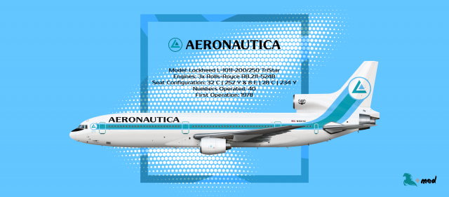
The Aeronautica Story - Part 3
- Owner: S K Y (View all images and albums)
- Uploaded: Jan 31 2019 04:48 AM
- Views: 1,019
- Album The Aeronautica Story
Story and livery design by SkySwimmer, template by Medviation. Usage restricted without explicit permission from creator. © 2019


You're right. I'm gonna fix it up later tonight.I believe 'inter-atlantic' (meaning 'between atlantic') isn't the right way to say that - it should be 'transatlantic'. 'Inter-continental' ('between continents') is correct. This livery looks great on the L1011 though!
On the basis* (sic: 'basic') + enough confidence* (sic: 'confident')! Just a few hiccups, but nice work on this series SKY <3
Text fixed.
Thanks everybody!
Livery itself is HOTTT. The background not so much. The halftone pattern takes the attention away from the livery and its also a modern style element. It would've never been used in the 80s...
fonts sad but rest makes mi glad
Find me a better one.
Livery itself is HOTTT. The background not so much. The halftone pattern takes the attention away from the livery and its also a modern style element. It would've never been used in the 80s...
This is a series album. You're basically saying that it's wrong to put my grandpa's photo in istagram because it didn't exist when he lived.
literally anything less curvyFind me a better one.
literally anything less curvy
Learn about the 70's and come back again when you're smarter.
seems like you have generic present day conceptions of what the 1970s were about and you're calling me cluelessLearn about the 70's and come back again when you're smarter.
i assume the font would work for some shady tropical airline, but considering this airline is based in Chicago it makes no sense. but fortunately, the font used in the lore s*** looks hella better and seems like itd work better on the livery.

 Sign In
 Create Account


I believe 'inter-atlantic' (meaning 'between atlantic') isn't the right way to say that - it should be 'transatlantic'. 'Inter-continental' ('between continents') is correct. This livery looks great on the L1011 though!