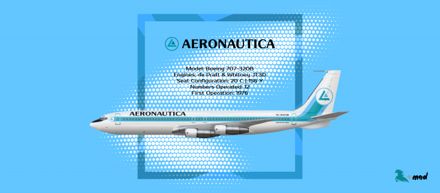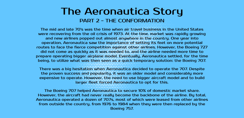
The Aeronautica Story - Part 2
- Owner: S K Y (View all images and albums)
- Uploaded: Jan 29 2019 11:50 PM
- Views: 744
- Album The Aeronautica Story
Story and livery design by SkySwimmer, template by Medviation. Usage restricted without explicit permission from creator. © 2019


Fresh. Love it.
Moony! I feel happy whenever you're commenting in my gallery!
more please
Good work as usual, I especially like how you work on the round surfaces to give more depth to your designs, though I do have some remarks:
- while it didn't strike me on the 727, the 707 wholly painted (engines & pylons, belly, wing fairing, ventral fin) looks a bit odd and maybe not 1970s-ish:
- in terms of era, I would argue that the font used, while nice, is a bit too modern;
- I'm really not sure what the regulation is in the US about registration fonts, but this one seems a bit too eccentric (though at this level of livery-making, it's really nitpicking ![]() )
)
Edge, you're mostly right. They don't look accurate for that time.
I have reasons, but I don't think they justify myself.
Overall, it's just about continuation to the next design (I did them backward from the current time), which I think will be more accurate and acceptable.
I'm going to review the designs again and see what I can tweak about them without sacrificing the continuation with the livery timeline.
- I'm really not sure what the regulation is in the US about registration fonts, but this one seems a bit too eccentric (though at this level of livery-making, it's really nitpicking
)
While I don't want anyone to quote me on it as I could be wrong, I don't believe there were any regulations in place about what font could be used for registrations. As long as the registration itself is legible, I think any sans-serif-y font could work.
Tweaks:
- changed font for title and registration.
- painted belly is not unknown in late 70's so I leave it like that.
- wings, pylons, and engines repainted with AFO VC-137C as reference.
Also tweaked fonts for 727-200.
I like this version much more, great work! The font especially is very 70s.
Nice thinking working backwards from your current identity, that's something I've used more than once ![]()

 Sign In
 Create Account


Fresh. Love it.