
 Sign In
 Create Account

- Owner: McKibbs08 (View all images and albums)
- Uploaded: Jul 17 2018 07:53 PM
- Views: 2,372
- Album Linjeflyg

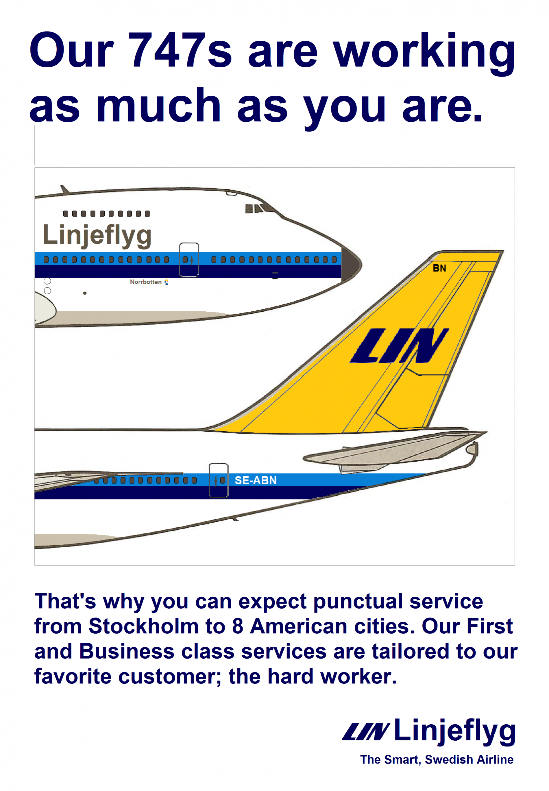
My vision of what an advertisement may have looked like in a magazine. I'm inspired by several airlines. the images came from Mike Machat and were edited by me. Hope you enjoy!


It's 1972. This is as proper as it can be. In fact, a bit too clean for that period printing technology.
I really like this. Although long term Med templates would probably suit the livery quite well, the fact that it isn't a Med template actually helps set it apart. That, and it's also just a really attractive and well thought out brand
Thanks!
I too also think that a flat, simple template like this perfectly suits the era and adds authenticity.
Nice work!
Thank you! eventually as the timeline progresses I might switch to med 
I like it... looks very respective to the era! And the livery is very on point for the era too! I like it.
Thank You 


I too also think that a flat, simple template like this perfectly suits the era and adds authenticity.
Nice work!