If at first you don't succeed...
- Owner: DSJTRAIN (View all images and albums)
- Uploaded: May 28 2016 11:58 AM
- Views: 1,948
- Album DSJTRAIN's Liveries
DSJTRAIN (Avant-garde paintwork) Medviation (Template)
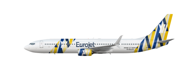
I've got all half term chaps.
Bloody hell.
I'm so in love with this brand/style/livery/ omg!
I see potential with the tail. Everything else though... ![]()
Bloody hell.
I see potential with the tail. Everything else though...
"Everything else", by which I assume you mean the pattern on the engine and towards the front, is exactly the same as the tail!
"Everything else", by which I assume you mean the pattern on the engine and towards the front, is exactly the same as the tail!
Yeah, don't put it anywhere else.
Yeah, don't put it anywhere else.
So - anything forward of the vertical stabiliser that isn't a word, "eurowhite" or some shade of deep blue is evil, is what i've gleaned so far. Anything else?
The tail design doesn't work. As myself and Med agree, there is potential, but at present it has no substance and cannot be interpreted with any meaning; it is just a collection of different coloured lines. The issues are much the same with regard the logo itself; it's not particularly memorable, it doesn't really say much. As a result, simply as a brand, the design fails. This is ignoring the fact that the logo cannot be at all easily distinguished from upon the design underneath.
The designs on the forward fuselage and engine are of course the same as featured on the tail, and thus the criticism is the same. Nevertheless, I personally would have refrained from including said design in these locations. In the case of the forward fuselage, it's a more contemporary idea to leave this clear, and simply include the word-mark and a logo. As for the engine, such a design in this location is more complicated to paint and, as is often the case, when cowlings are replaced the design can appear mismatched and misaligned.
These are my main criticisms overall. I can go into further detail about selected aspects if required.
Allow me to explain my design choices. The original logo was three stripes of light yellow, yellow and blue intersected by a bar across the two yellow bars, which is supposed to be an abstract represtation of the colours of the European flag and "interconnectedness". I created a pattern from the logo, as in this layout it looks like a house of cards, one layered on top of the other, and matched up the bars so they all linked together (again with the "interconnectedness"). The tail design probably looks more obvious in earlier versions, but as no-one seemed to like those, I enlarged the stripes so it appeared simpler. I made the logo white in this one simply as an artistic motif, however I agree it does rather blend in with the rest of the pattern, which I had tried to alleviate by making the background of the pattern a very light grey (a colour in common with previous liveries). I painted the engines in a very enlarged version of the pattern on the tail, so that it was really just coloured lines, ergo, would be simpler to paint in real life.
I took the idea of patterned engines from Air Malta, whom I had the pleasure of working for during a work placement,when they also explained the reasoning behind their livery to us.
I dislike planes being largely bare at the front, they always look boring to me.

 Sign In
 Create Account







Bloody hell.