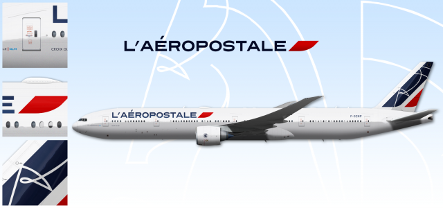
012 - L'Aéropostale, Boeing 777-300ER
- Owner: edge (View all images and albums)
- Uploaded: Mar 12 2016 03:33 PM
- Views: 2,718
- Album edge's designs

New take, with an original font and slightly updated presentation.
A personal favorite, by a mile.
L'Aéropostale is a legacy french airline formed in 1933. It retained its original name, synonym of a glorious past of prestigious routes and technical achievements, even after carrying mail wasn't its main activity.
Its logo, affectionately nicknamed "La crevette" ("The shrimp") by the insiders, remains today in a sleeker, more modern form. It combines the head of a horse, symbolizing power, the tail of a fish, reminder of the original seaplanes, and the wings of a bird, conveying the idea of speed.
What's not to love ?
I think it's good, adds a bit of individuality to his template. My issue is that the view is very much perpendicular to the aircraft, yet you can still see the starboard wing even though you shouldn't...
Your templates are amazing, and I love the fine detail, but having the wings flexed as if they are in flight just looks really strange.
Thank you ! I see your point regarding the flexed wings, I think it makes the whole think more dynamic, but you're right : I might have forced it a bit too much ; I'll look into that ![]()
I think it's good, adds a bit of individuality to his template. My issue is that the view is very much perpendicular to the aircraft, yet you can still see the starboard wing even though you shouldn't...
I'll look into that too, though it doesn't strike me that much considering the perspective of it all ?
I think a little flex on the wing is aesthetically pleasing and the staggering of the wing where you can see the starboard wing is fine. In fact it makes the template more stylish. Most of the livery design happens in the fuselage, tail and engines anyway so the wings have more freedom to be represented more loosely.
Personally, I prefer keeping my templates on the conservative side by representing the aircraft as a flat side view blueprint. Although I put a slight droop on the wings on larger aircraft since you don't see them perfectly straight in real life. Drooping wings would also give slightly more view of the fuselage than a wing flexed upward.
In the end, to each his own. Good job! ![]()

 Sign In
 Create Account


Your templates are amazing, and I love the fine detail, but having the wings flexed as if they are in flight just looks really strange.